Sketches
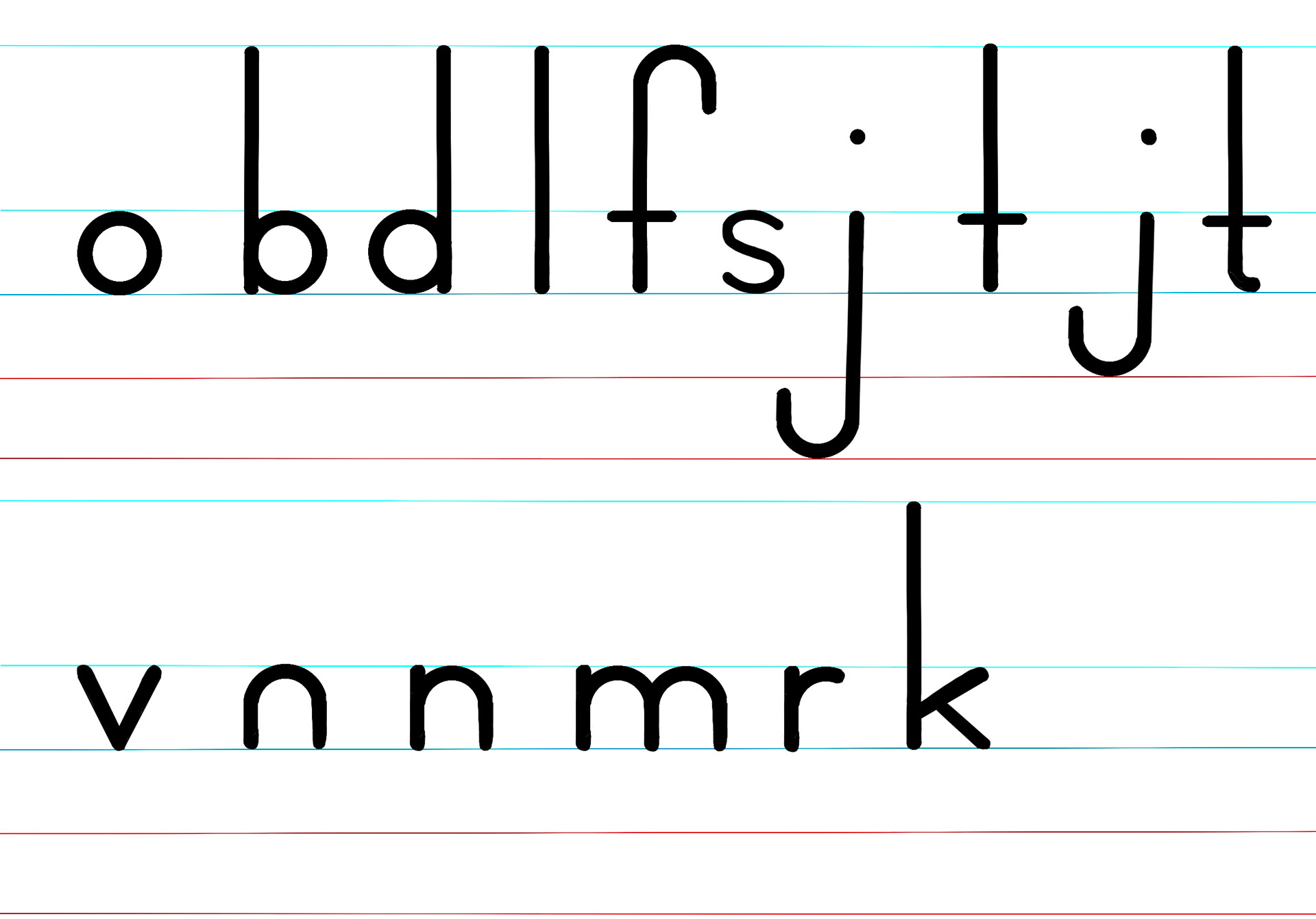
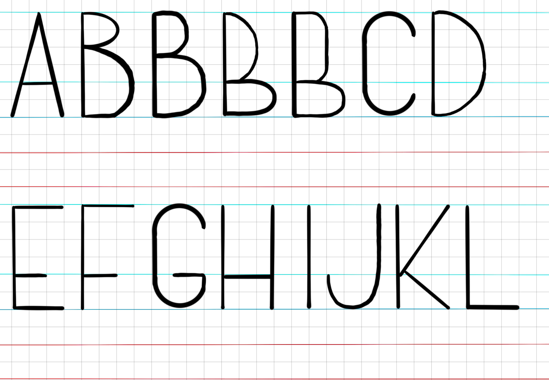
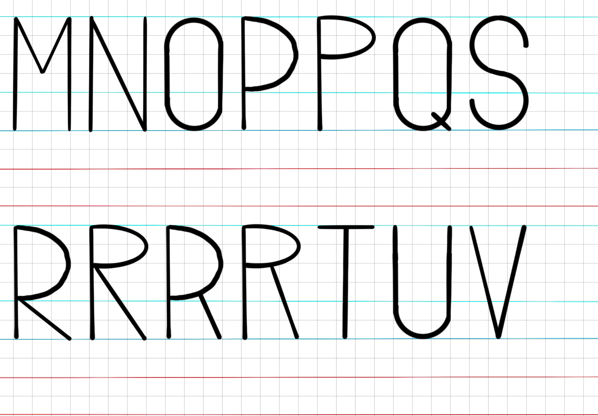
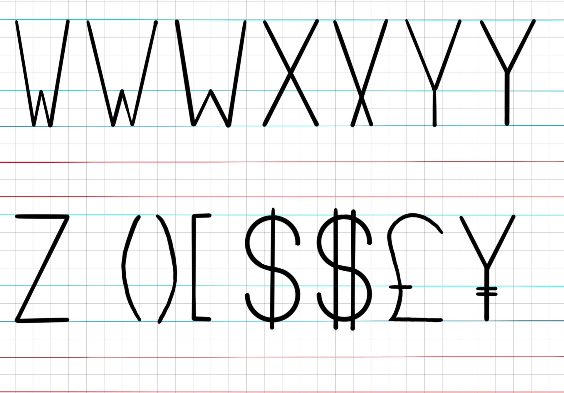
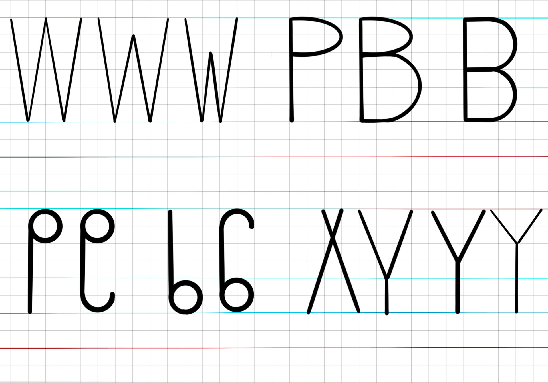
Proceritas Regular V1
No Spacing or Kerning Implemented
Ligatures
I decided to switch the placeholder name of Proceritas to Sublimis which is the Latin word for High or Lofty.
Sublimis Regular V2
only the lowercase glyphs have been spaced at this point. No kerning has been implemented.
It was at this point I realized a dilemma with creating a specimen book centered around a display font. I would need to either utilize the display font for body text, which would hurt legibility, or pair another font for the descriptive text. Both of these options didn't feel right. So I decided to create another typeface that utilizes most of the same geometry, metrics, spacing, and kerning but without the featured elongated ascenders and descenders. This reusing of the metrics and geometry would save me hours of work. The first font took me over 15 hours to get to the version 2 stage. The first draft of the converted font took 2 hours.
I named this font "Sub Sublimi" or "Not quite high/lofty. "
I named this font "Sub Sublimi" or "Not quite high/lofty. "
Sub Sublimi Regular V1
This proof of concept highlighted the increased legibility and showcased that reusing the same geometry still worked and looked visually appealing even without its key feature.
Sublimis Bold and Thin V1
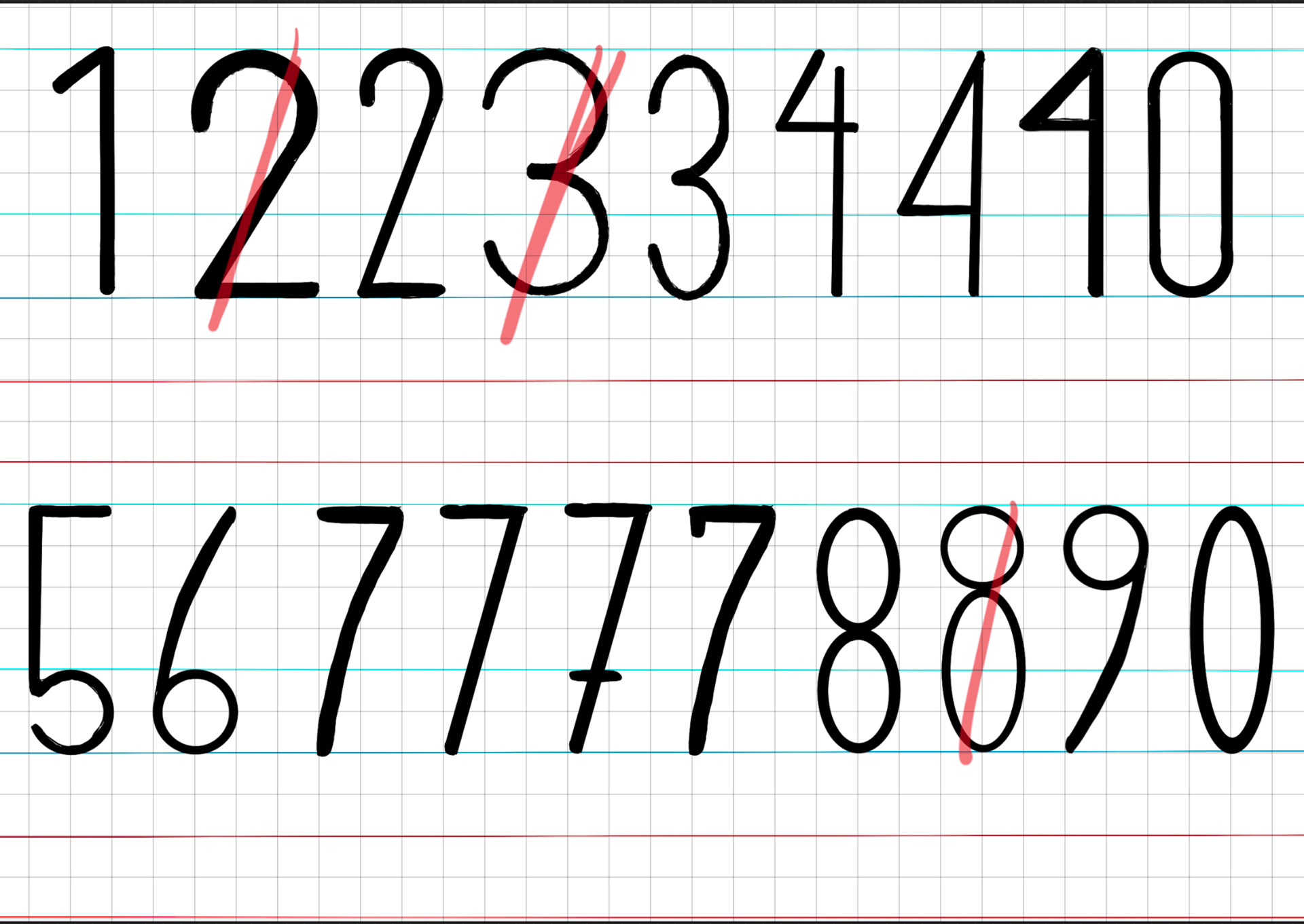
The Bold and Thin variations are 40 units thicker/thinner than the regular font. The exterior metrics of the glyphs remain the same while the counters are shrunk (where applicable). As the counters dictate the spacing, I will need to make slight adjustments to my sidebearing metrics. This depicts only the letters and numerals. The spacing, kerning, and additional glyphs haven't been updated/added yet in this draft.
Critique Notes
Suggested I used the same curve stresses on the upper portion of 3 and 8 as I used on the lower portion and on the 0.
The curvature on the 6 and 9 looks off.
The "S" and "s" look like they are from different font families.
The fl and ft ligatures look too much like a stylized A. Consider giving the letters l and t a foot or adding a gap to improve legibility.
The curvature on the 6 and 9 looks off.
The "S" and "s" look like they are from different font families.
The fl and ft ligatures look too much like a stylized A. Consider giving the letters l and t a foot or adding a gap to improve legibility.
Next Checkpoint
I fixed all the issues from the previous critique.
I decided to change my ampersand to something that looked closer to its Latin origins of "et."
I created all the obliques and finished all the missing glyphs resulting in a total of 10 fonts and 1,290 individual glyphs.
I exported the font and tested it out for the first time in InDesign. The leading was completely off in InDesign but working just fine in Microsoft Word. After some research, I learned that the line spacing metric in Fontlab is only used by basic software whereas typographically savvy software (like the Adobe Suite) adjusts its leading metrics off of the em height. My Sublimis glyphs spanned a total of 2500 UMP and I had left the em height at 1000 UMP. Changing the UMP has fixed my issue but resulted in the point size being much smaller than what it was before. The Sub Sublimi family only needs an increase of 500 UMP, which would fix the leading, but the geometry would be physically larger at the same point size than its peer.
The Bar and Broken Bar need to be exaggerated.
I just have spacing, kerning, fixing the bars, and replacing the ampersands left before the fonts are complete.
I have decided that the specimen book will be a
