This was a group project done in collaboration with Bailey George.

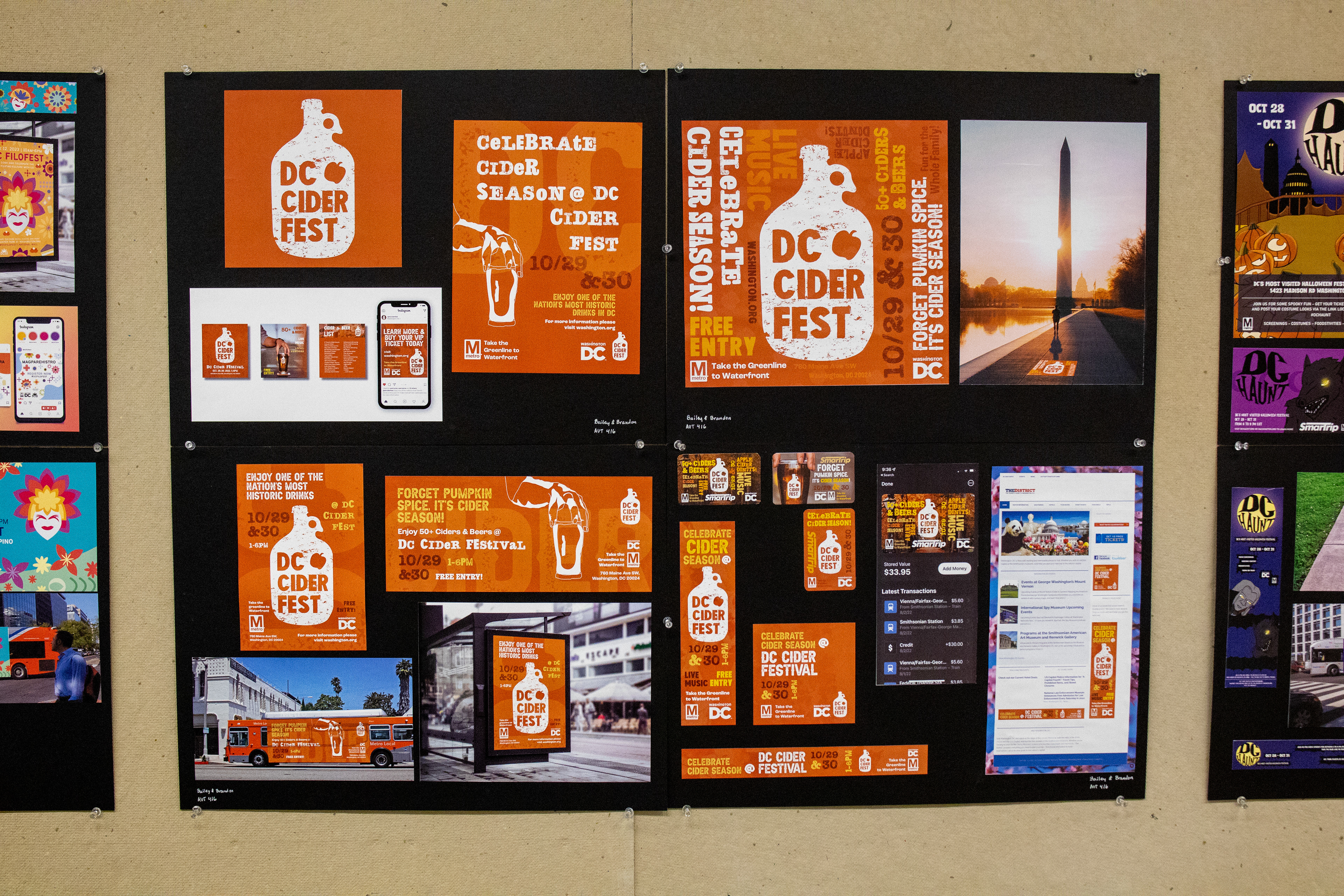
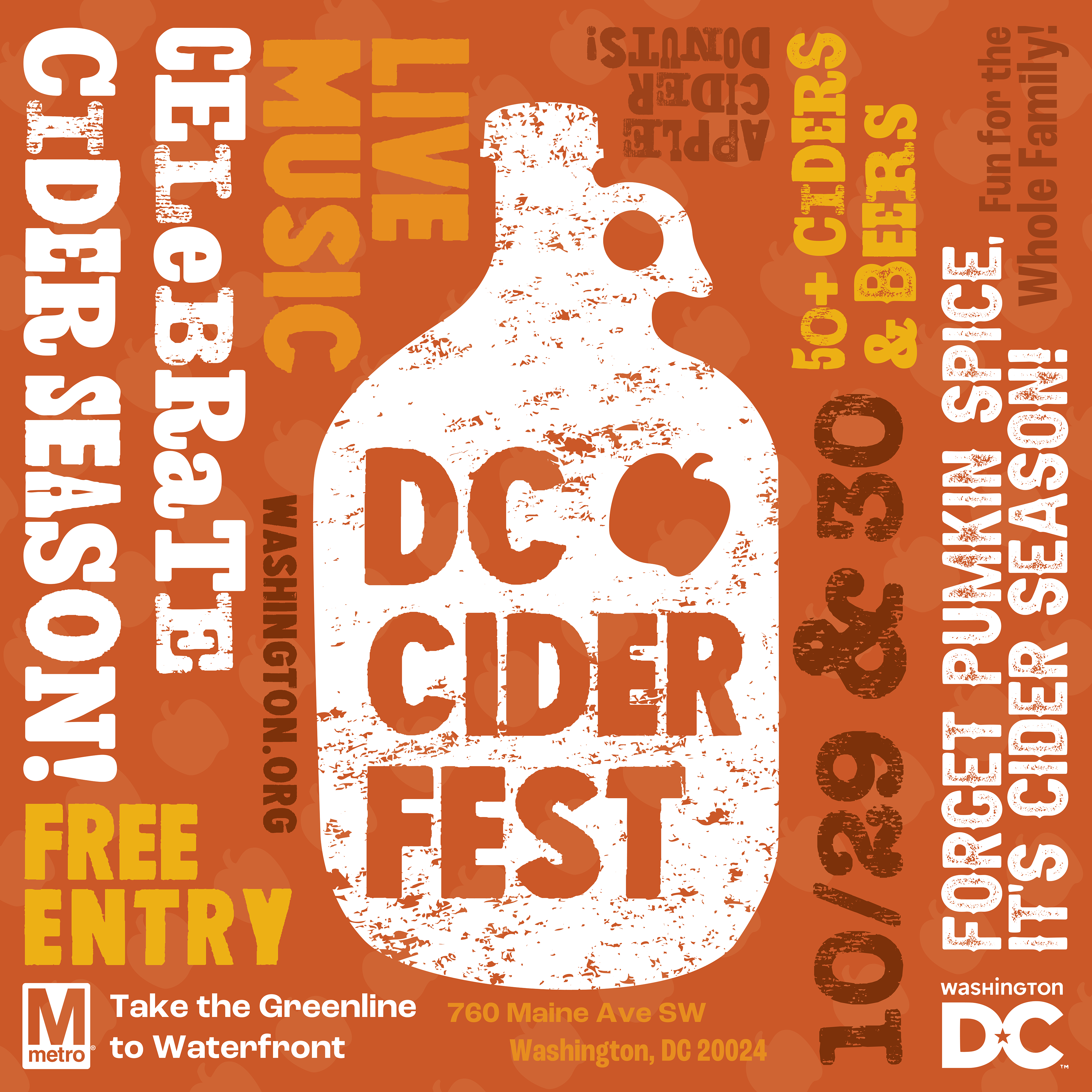
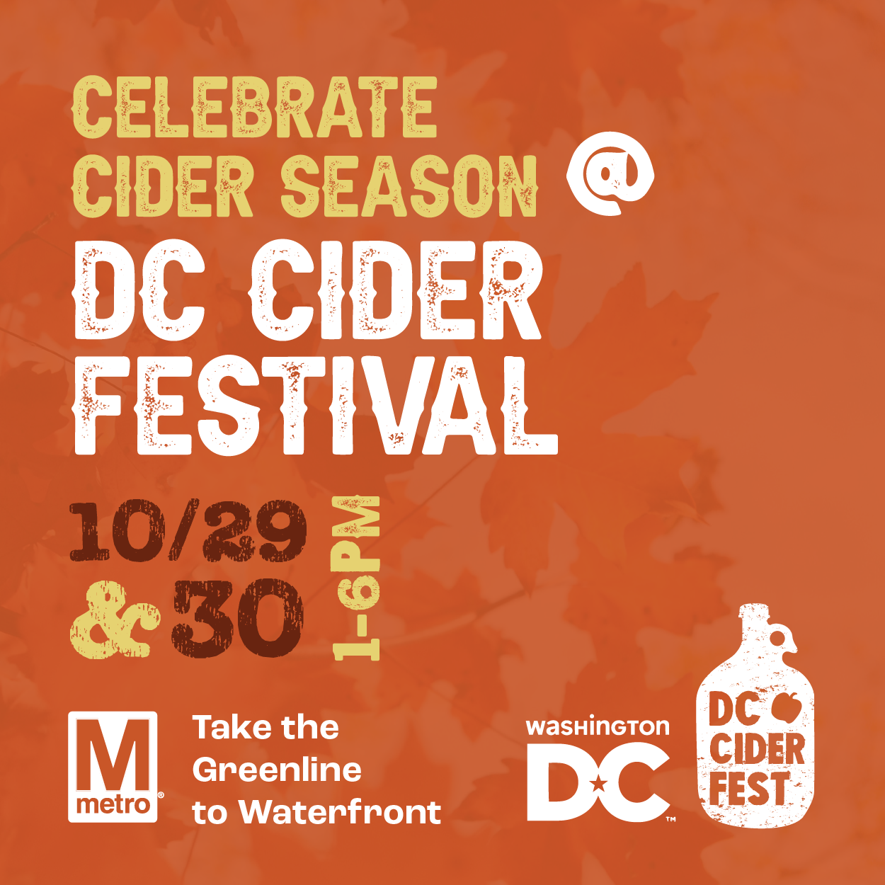
The purpose of the project was to come up with an Ad Campaign that would drum up tourism in DC in collaboration with the Metro. We decided to create a Cider and Beer festival that takes place in the Fall.
Creative Brief
This team project will be on a DC Cider Festival that takes place in the fall of 2022. This festival takes place annually in the Fall, but in a different city each year. DC will be hosting the festival this year and will need a new logo along with collateral for the festival’s advertising. The current festival that is similar to the one we are creating is called the "Rock the Core Cider and Beer Festival" which showcases both beer and cider. This “Rock the Core” festival focuses on an apple core for the logo with a strong red color palette. We plan to draft other types of logos, not entirely focusing on the apple itself.

The desired outcome of this project is to appeal to a diverse audience of the ages ranging from mid 20’s to mid 40’s. Our team’s goal is to successfully advertise this festival in a way that motivates locals to attend. We plan to do this by using a friendly fall color palette, a unique logo, and fun compositions. Cidery festivals in the past have also used fall color palettes and we are planning to do the same in order to make this project look as real as possible.

The ­name we are thinking of choosing as of right now is either the DC Cider Festival or The Annual Cider Festival: DC. Our plan to start this ad campaign begins with researching other cider events' logos and ads, creating our own logo and brand for the campaign, drafting the print ad, and the start in with the other collateral. The mood we are going for is mainly friendly with a hint of fun and sophistication. The timeline for this project is 4 weeks and there is no theoretical current budget.

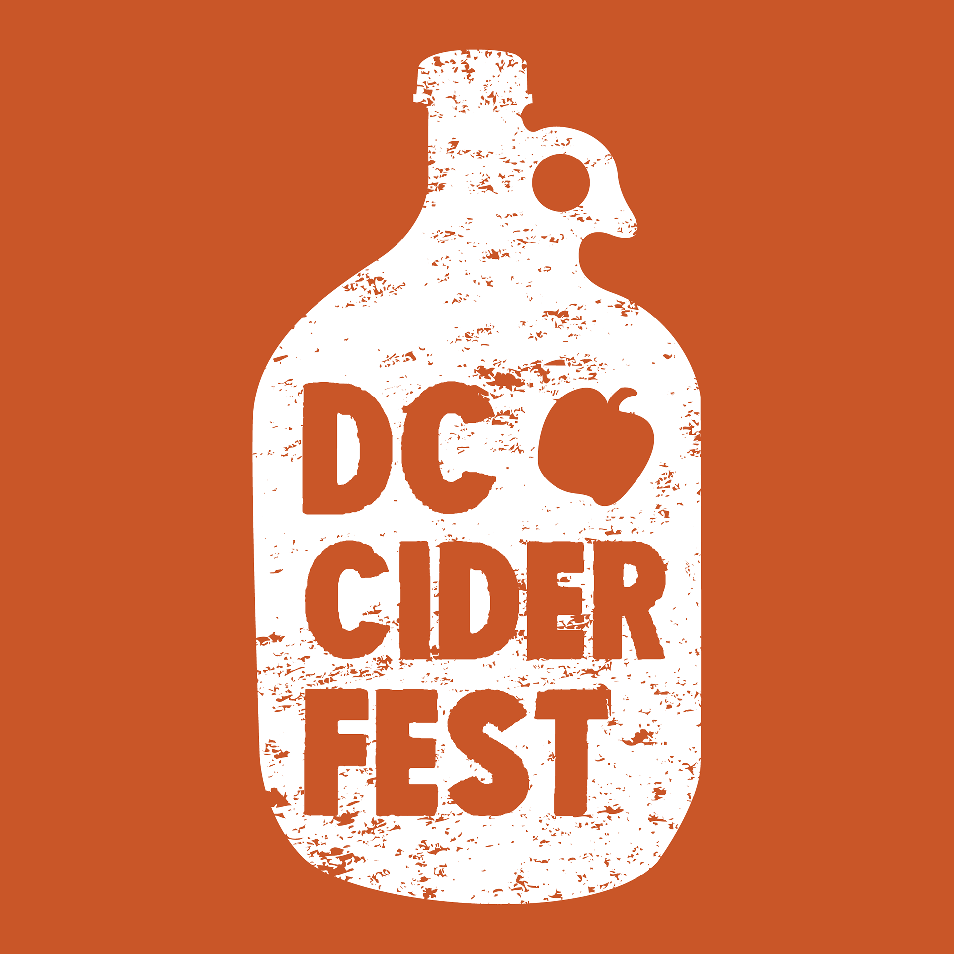
I was drawn to the idea of using a cider jug as I felt its shape was iconic enough to be instantly recognizable while also avoiding the cliche of just using an apple for the logo that most cider festivals seem to subscribe to. I wanted a logo that could stand out while also effectively conveying the message.

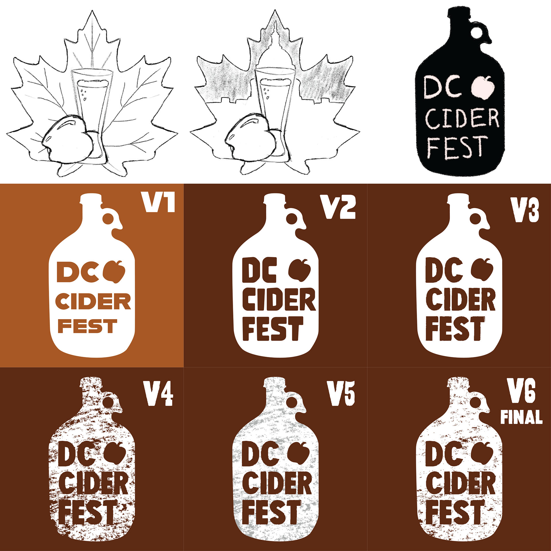
For my initial Sketch Ideas for the logo. I wanted to steer clear from using the apple as my base, so I experimented with bringing the fall element to the for ground and showcasing containers used for beer and cider.

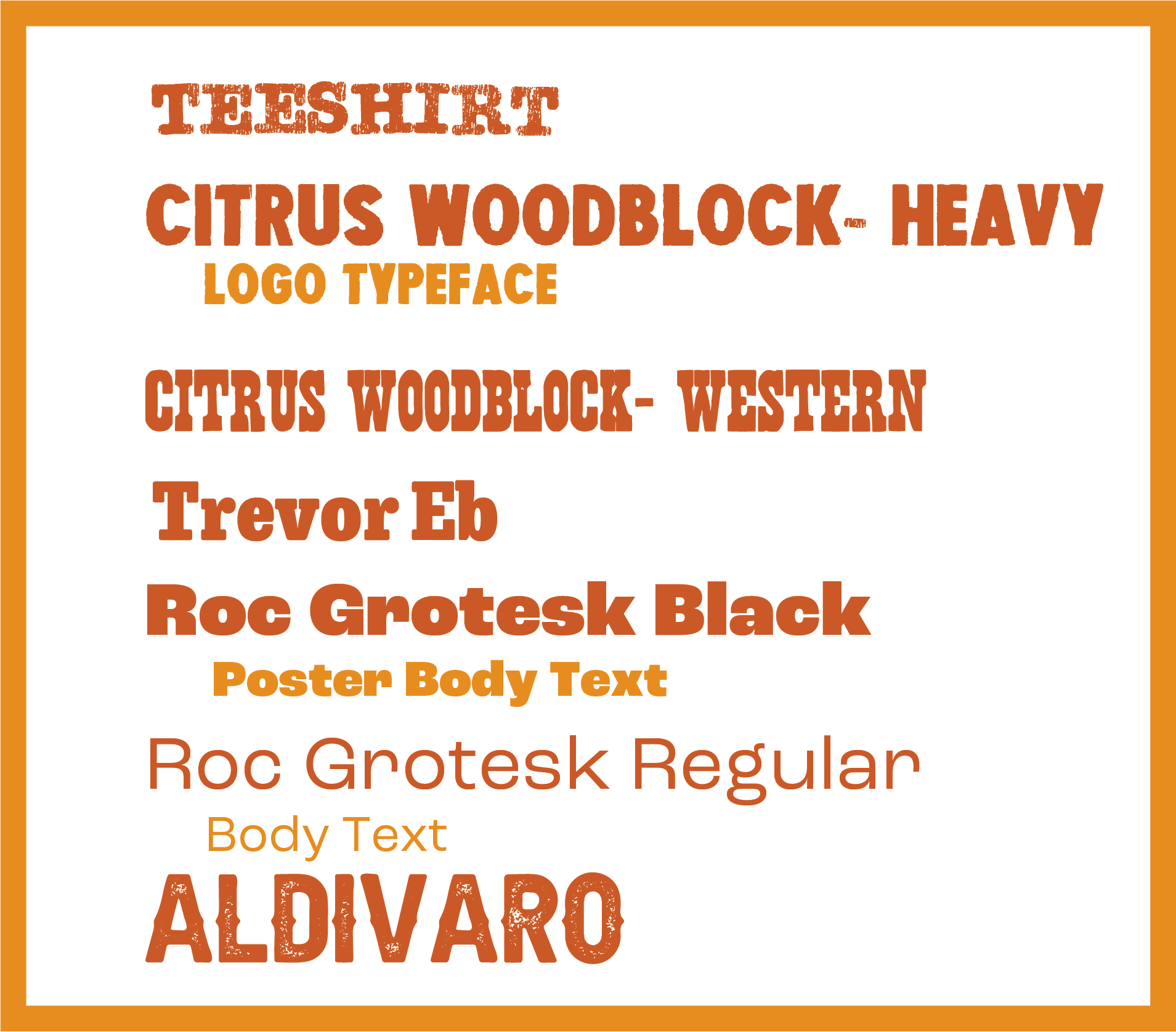
We wanted our designs to have a handmade quality so we took inspiration from woodblock type. I designed the two Citrus Woodblock typefaces based off reference images of various woodblock sets I found online. I had plans to design two more but decided to fill out our roster with other fonts due to time constraints. The goal was to mix and match typography like a designer who was trying to get by with a mismatched set of woodblock type. Trevor Eb was chosen because of its similarity to Citrus Woodblock Western and Teeshirt and Aldivaro were choosen for their textures which give them a stamp like appearance.

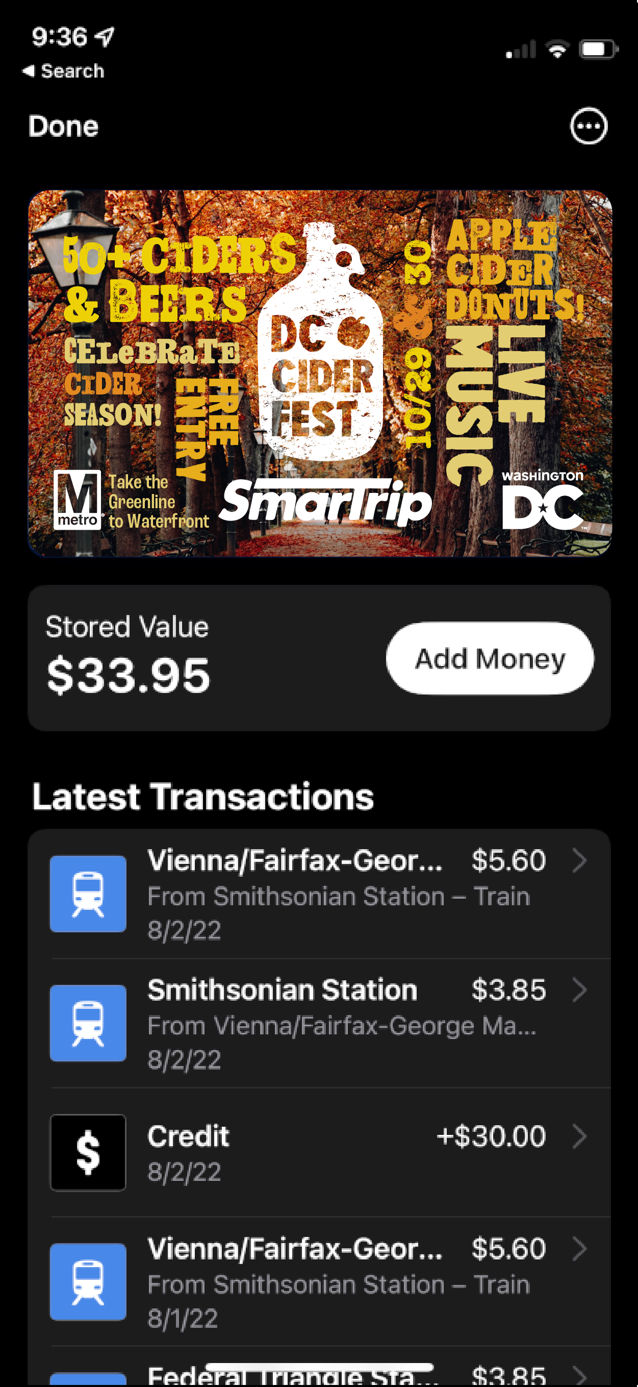
SmarTrip Cards- Designed by Brandon Kleeman

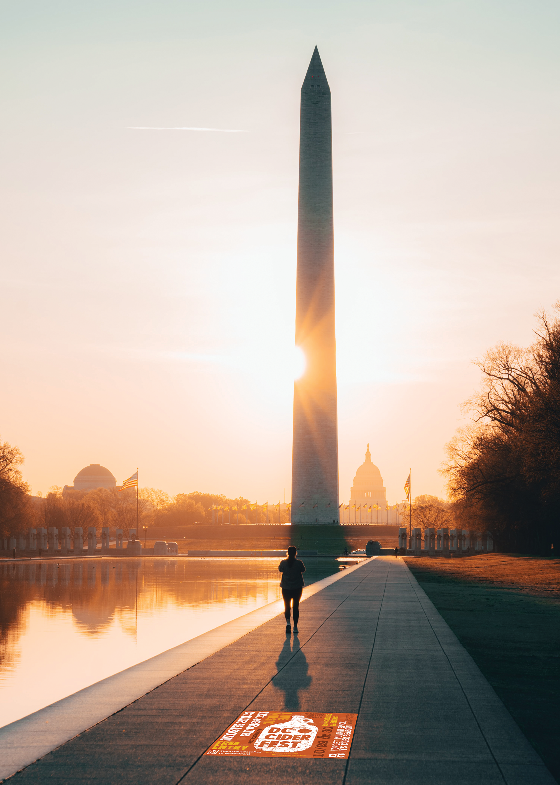
Sidewalk ad- Designed by Brandon Kleeman

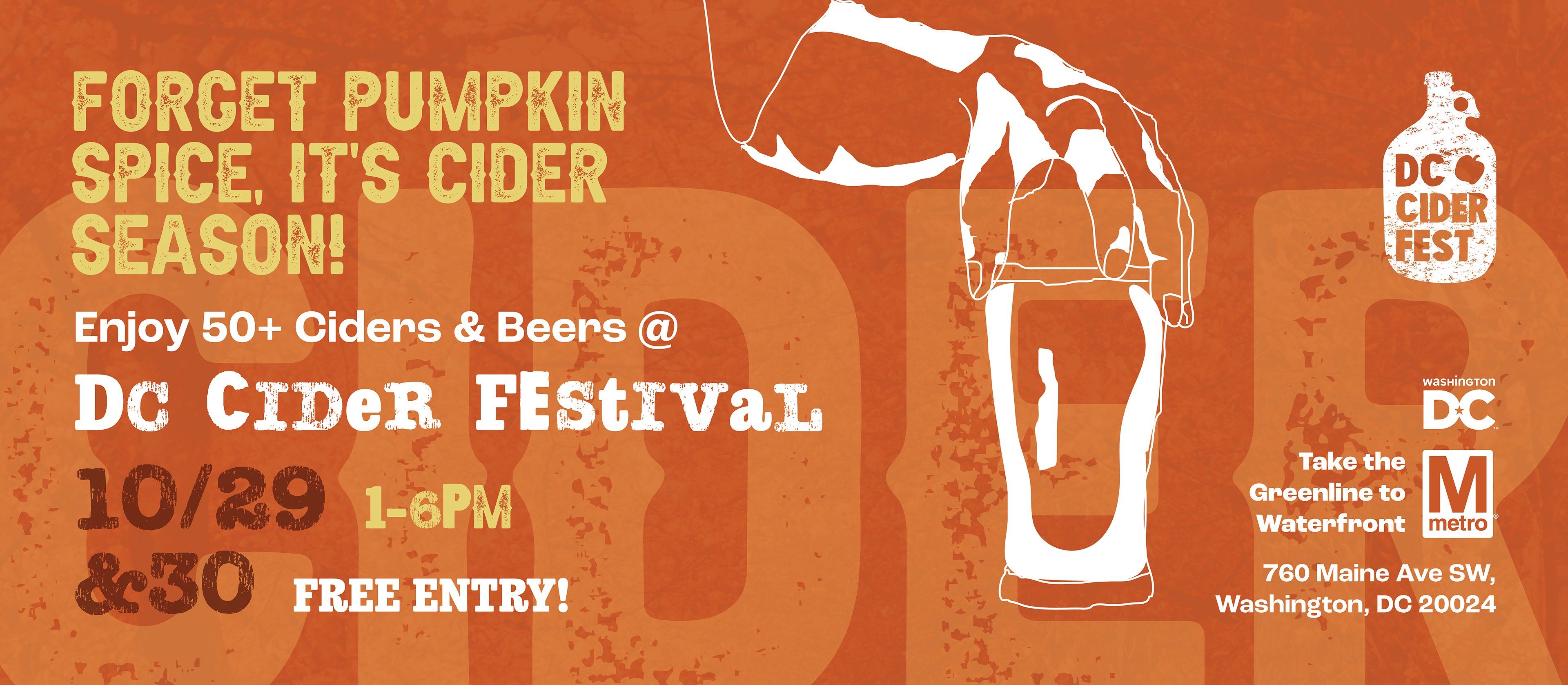
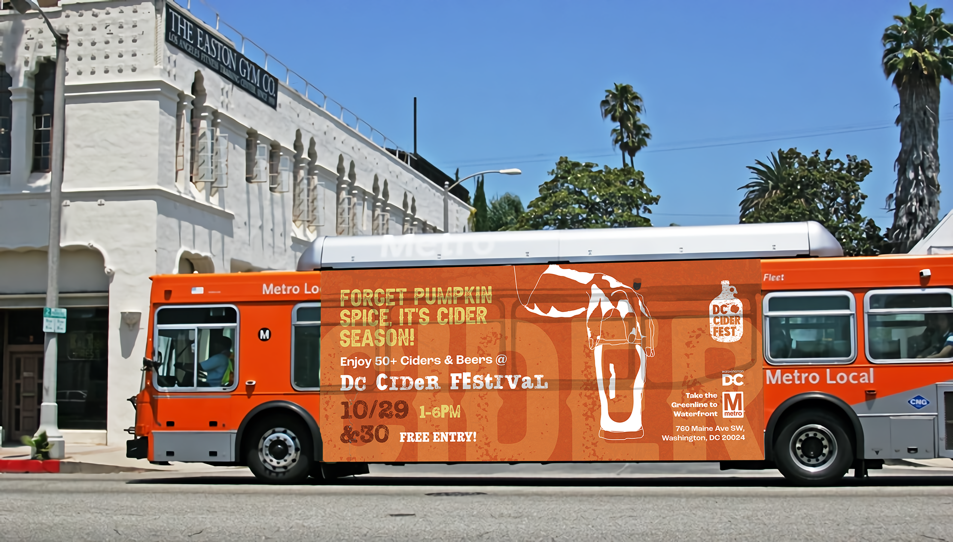
Bus Wrap ad- Designed by Bailey George
Mockup edited by Brandon Kleeman

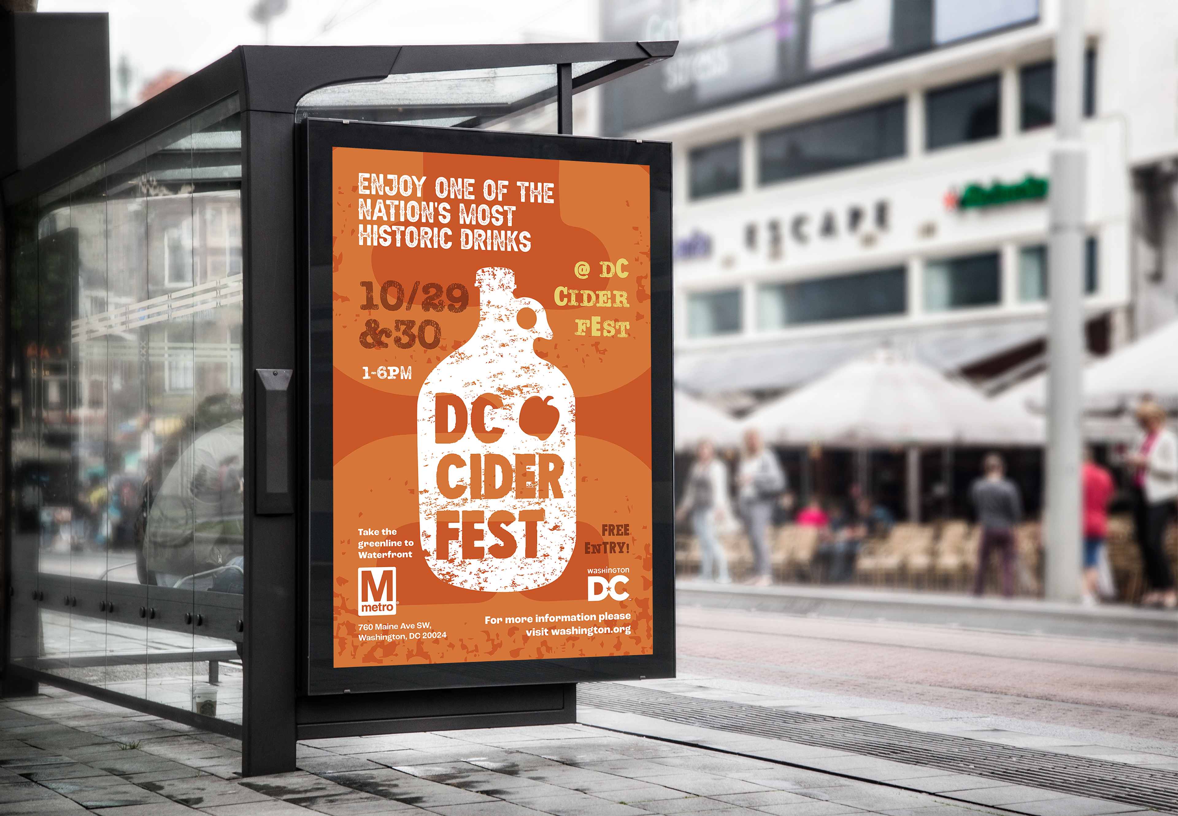
Bus Stop ad- Designed by Bailey George

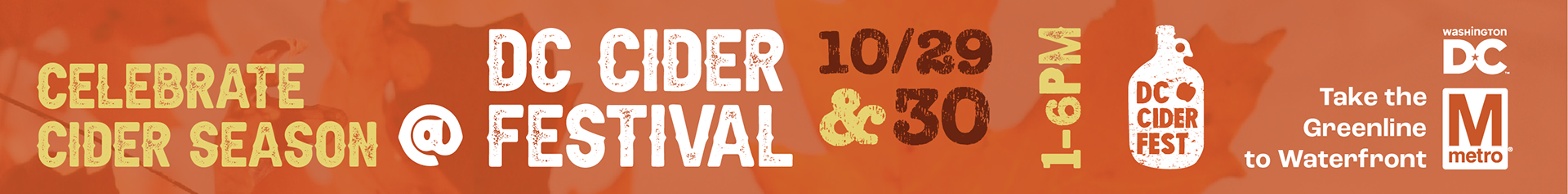
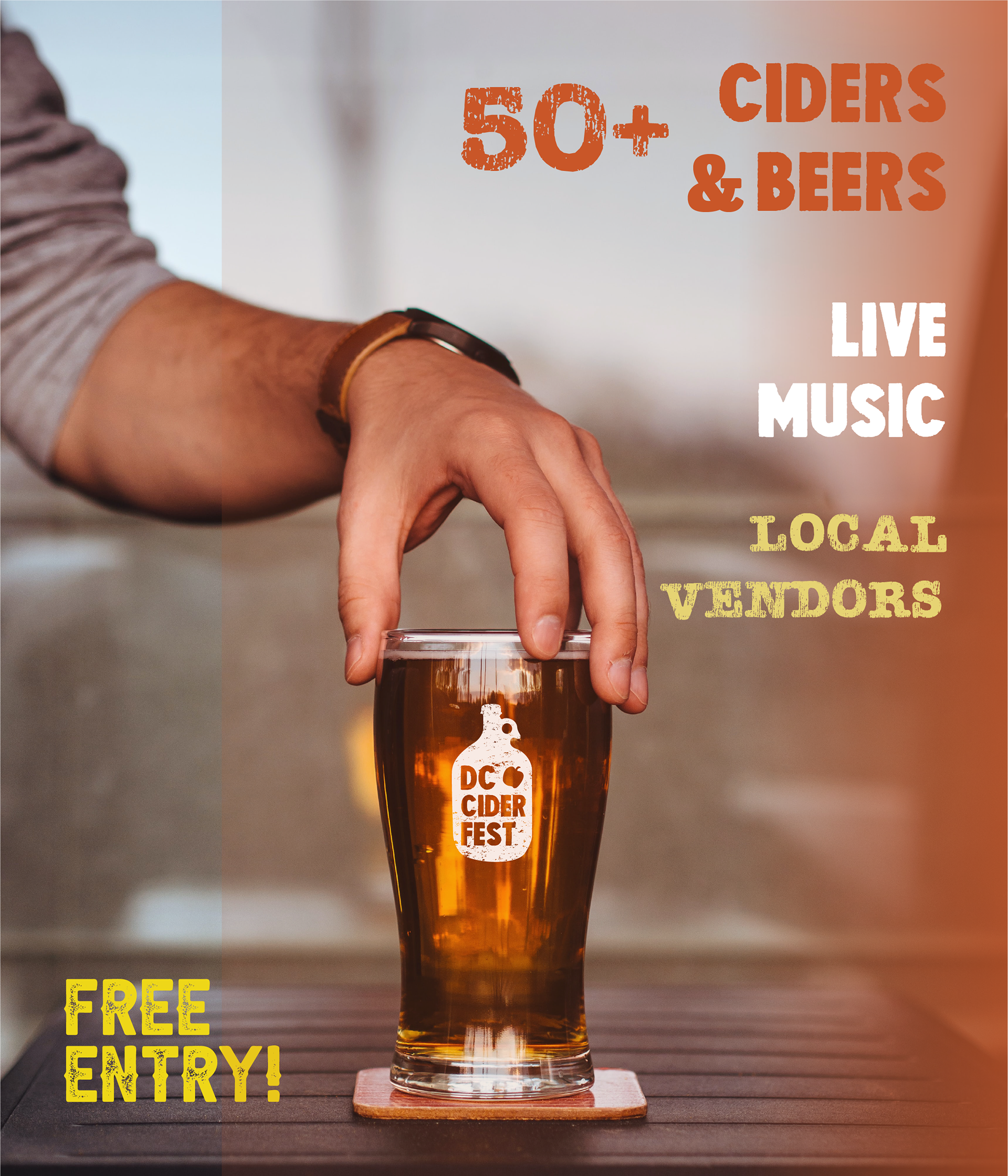
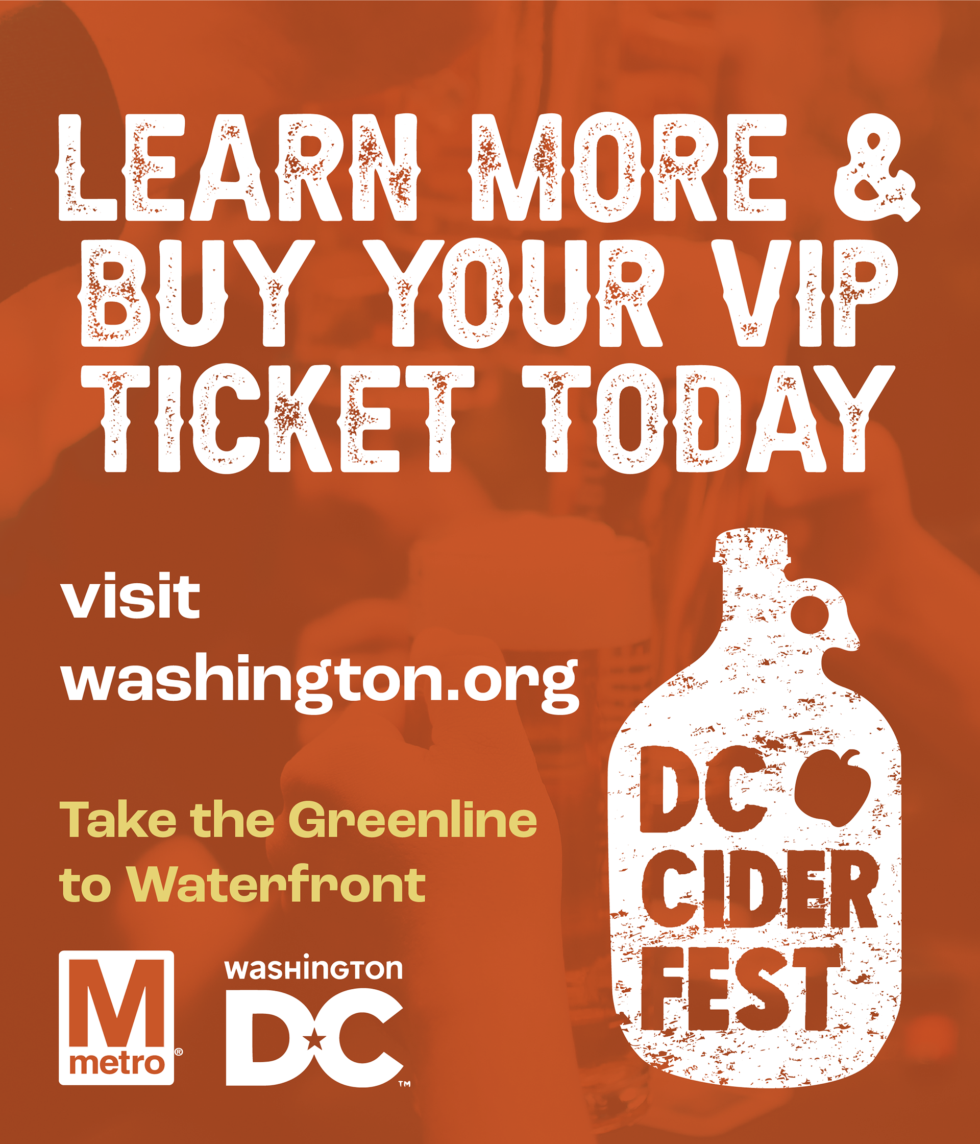
Digital ads- Designed by Bailey George
Mockup and edits to the vertical ad were done by Brandon Kleeman

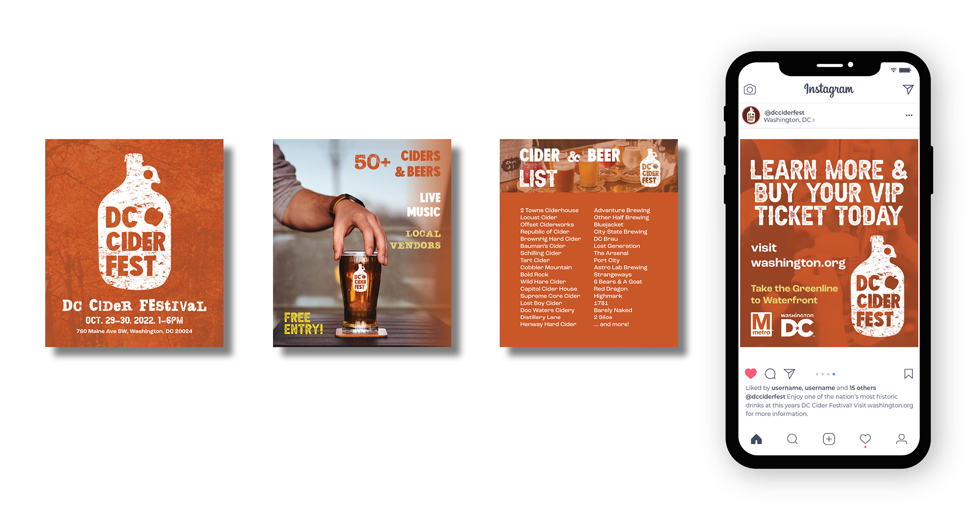
Instagram ads- Designed by Bailey George

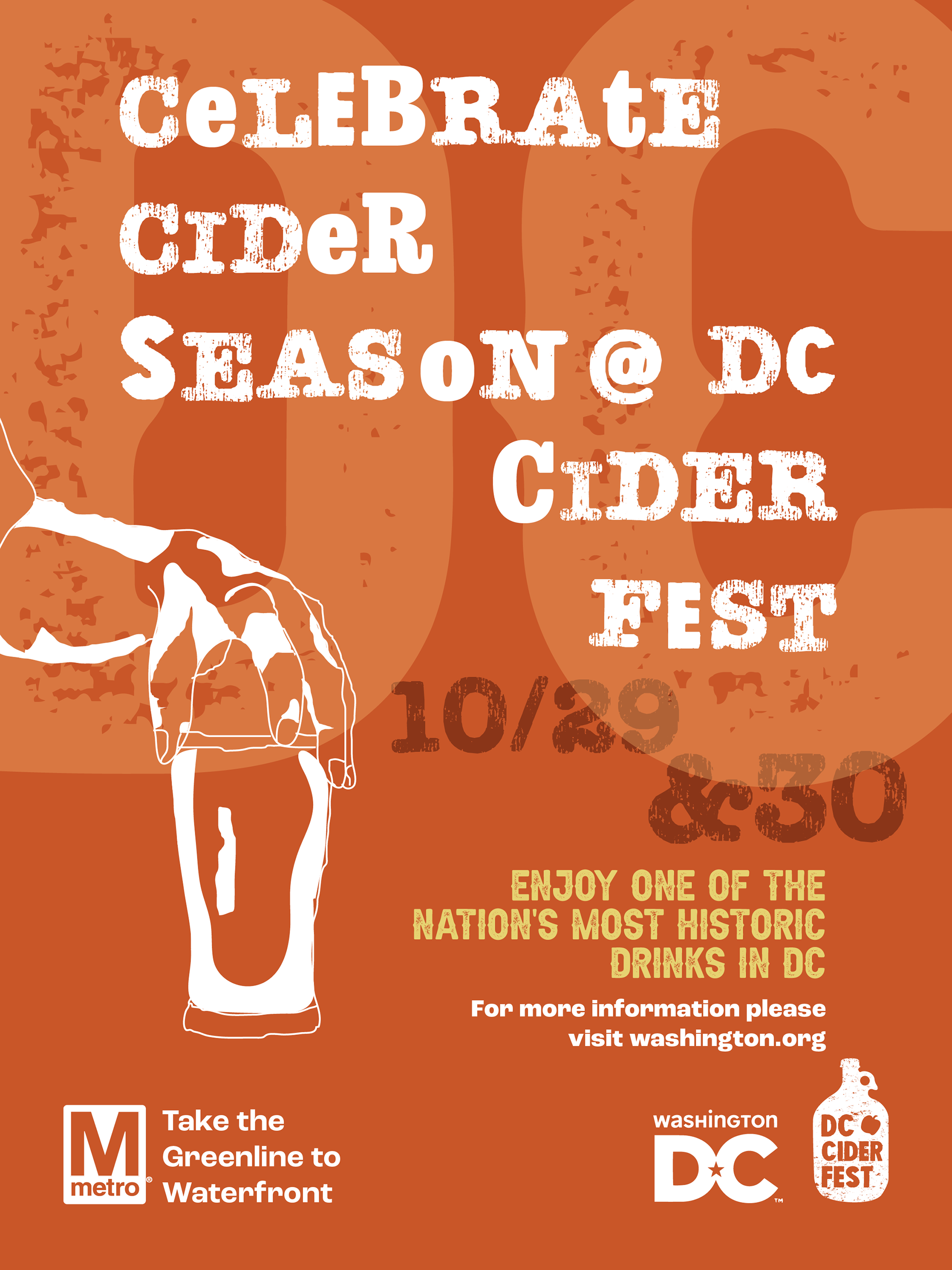
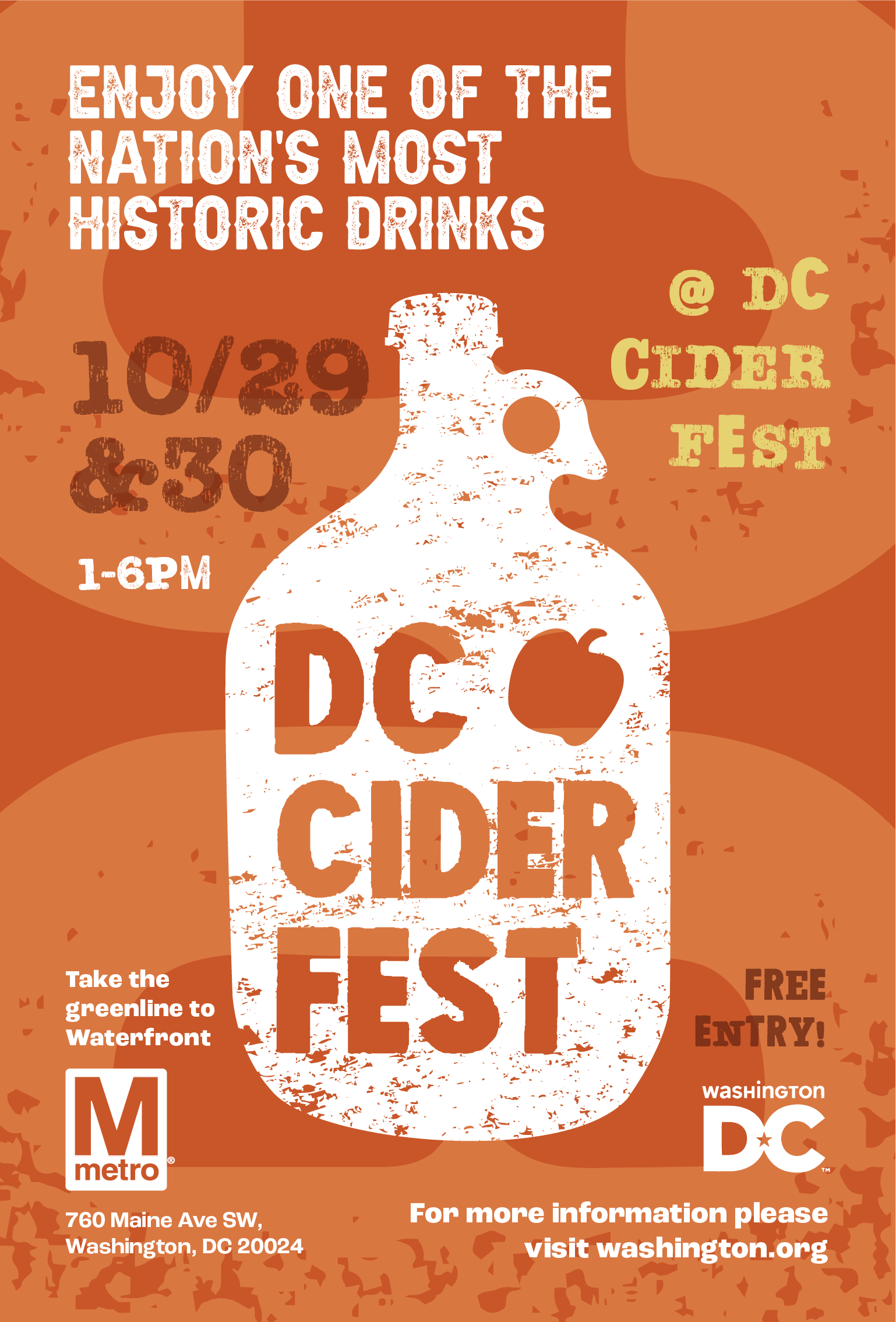
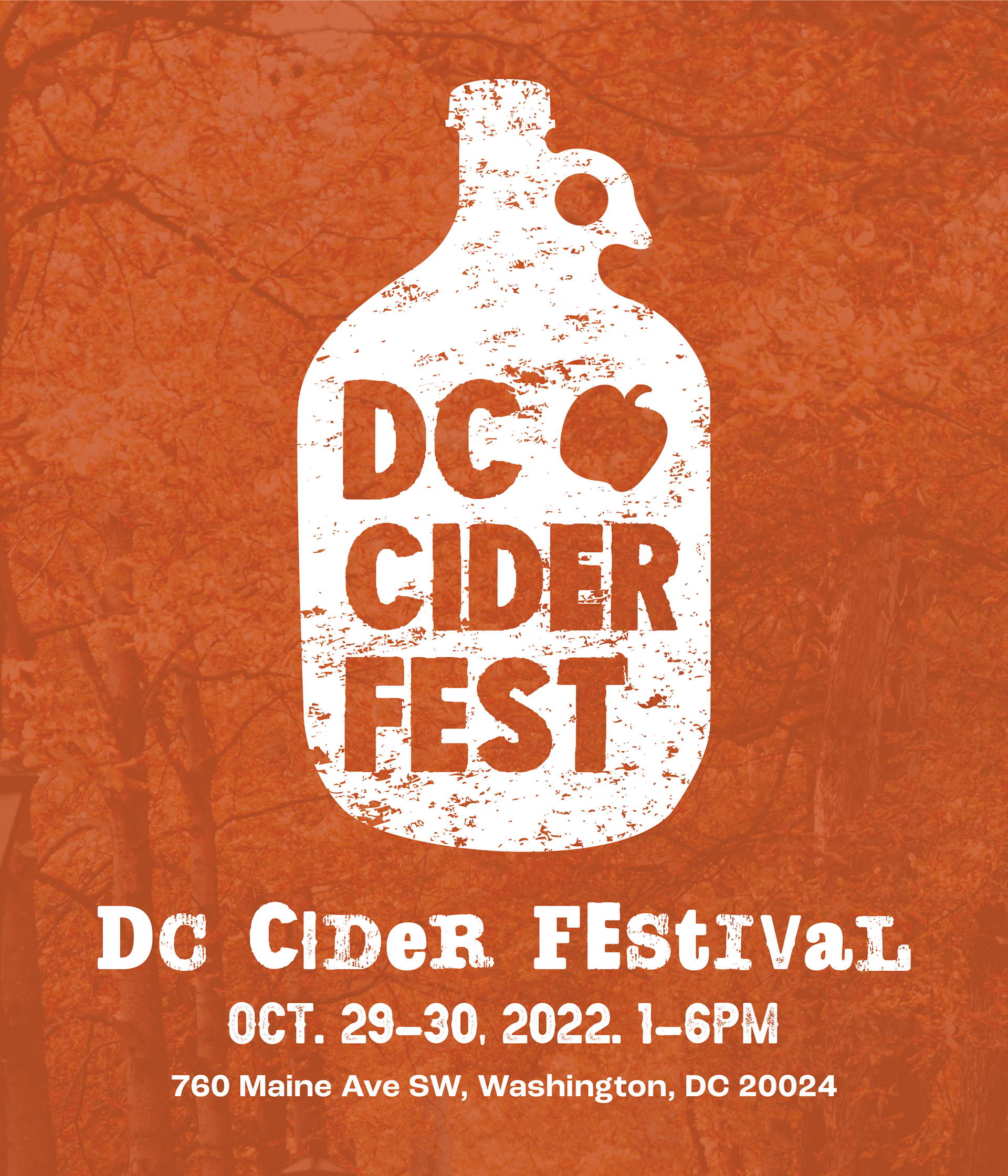
Print ad- Designed by Bailey George

Project Challenges
We were unfortunate enough to be suffering from alternating ailments throughout this project resulting in us only meeting in person once out of the four times scheduled. Despite this setback, we were able to compensate by using online tools such as Slack, Mural, and OneDrive to share files and communicate ideas, and created a project I am quite proud of.
Back to Top