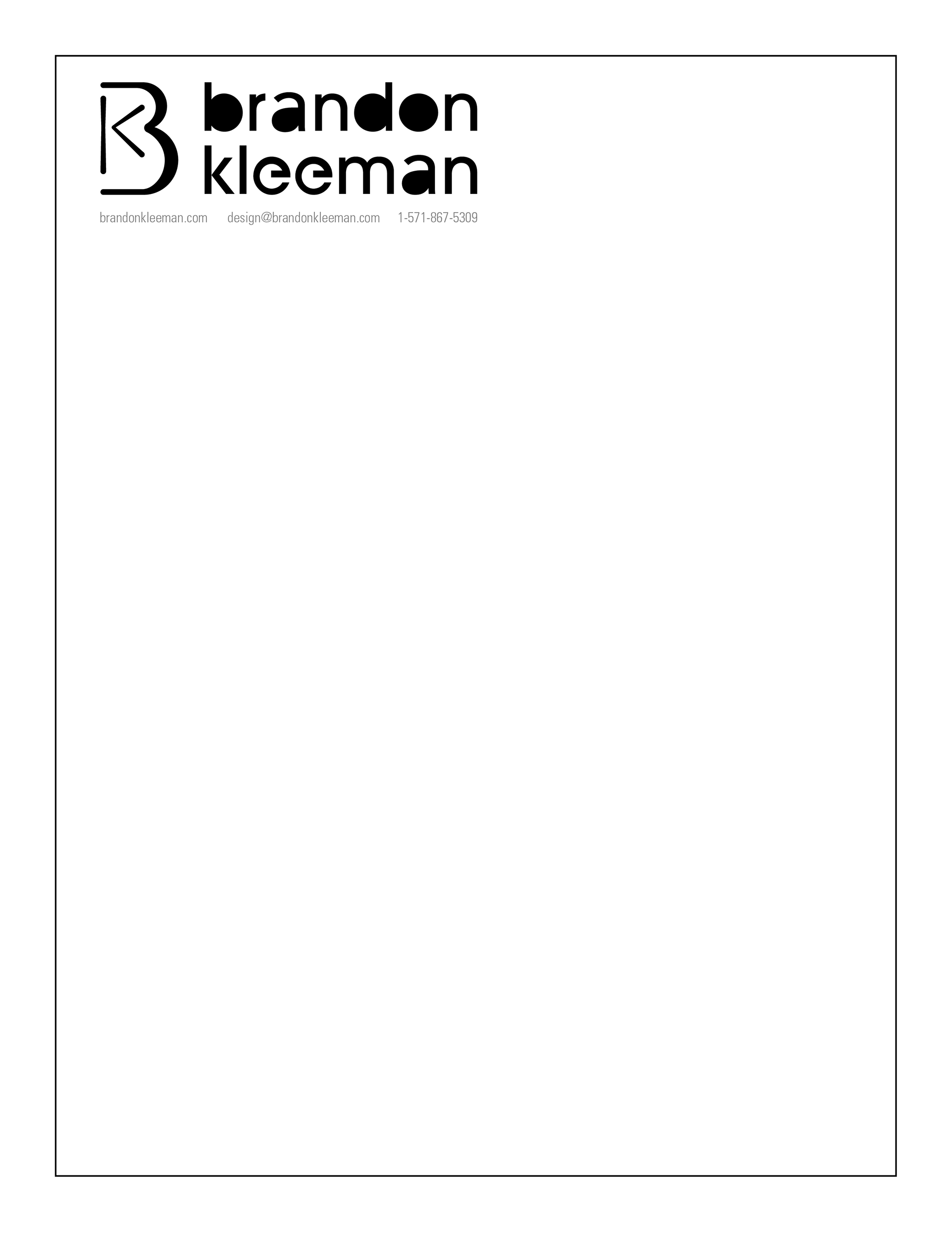
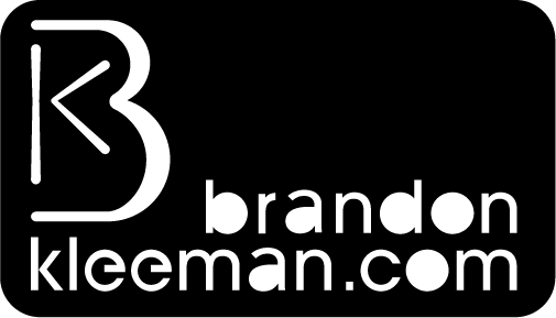
Old Logo

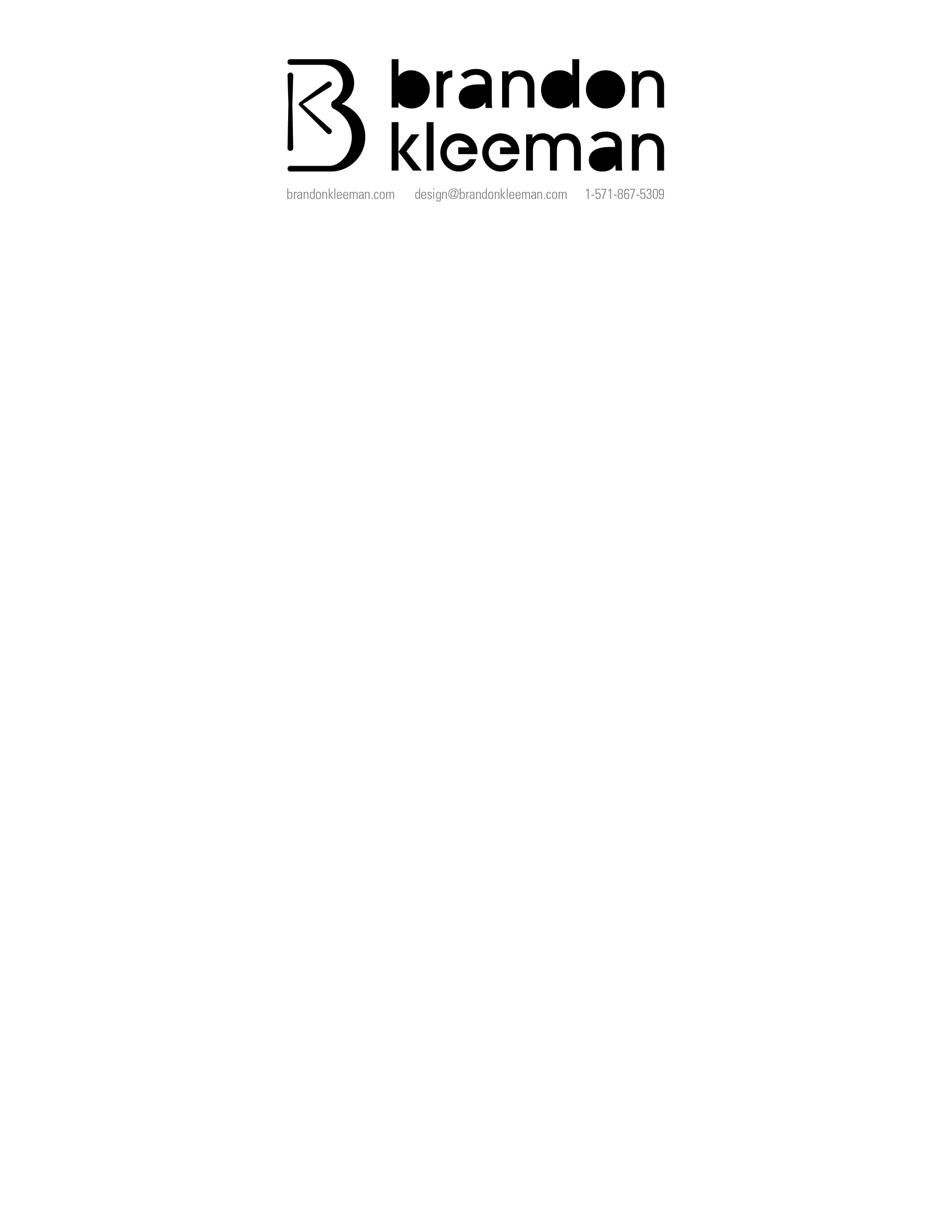
Redesign
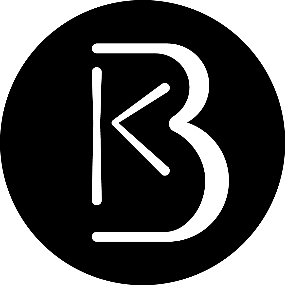
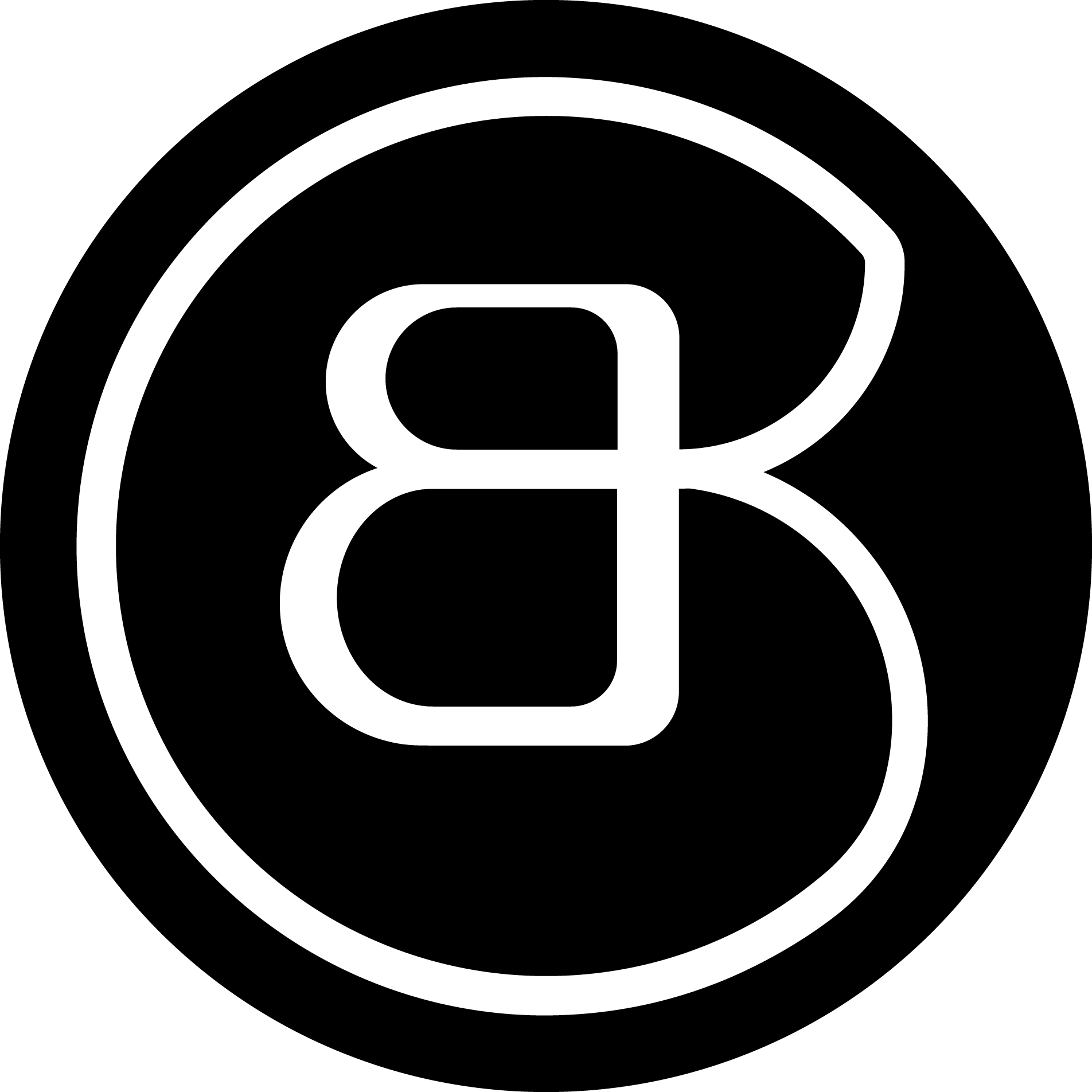
Upon surveying multiple designers and non-designers I found that the K was often lost in translation and the circle was sometimes read as a C. This resulted in the logo being read as CB with an unoptimal backwards B.
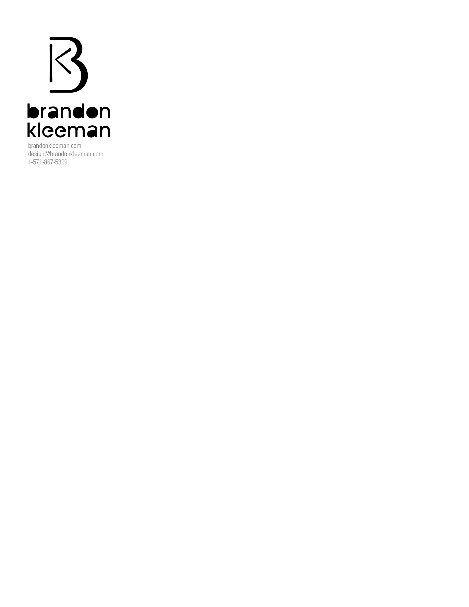
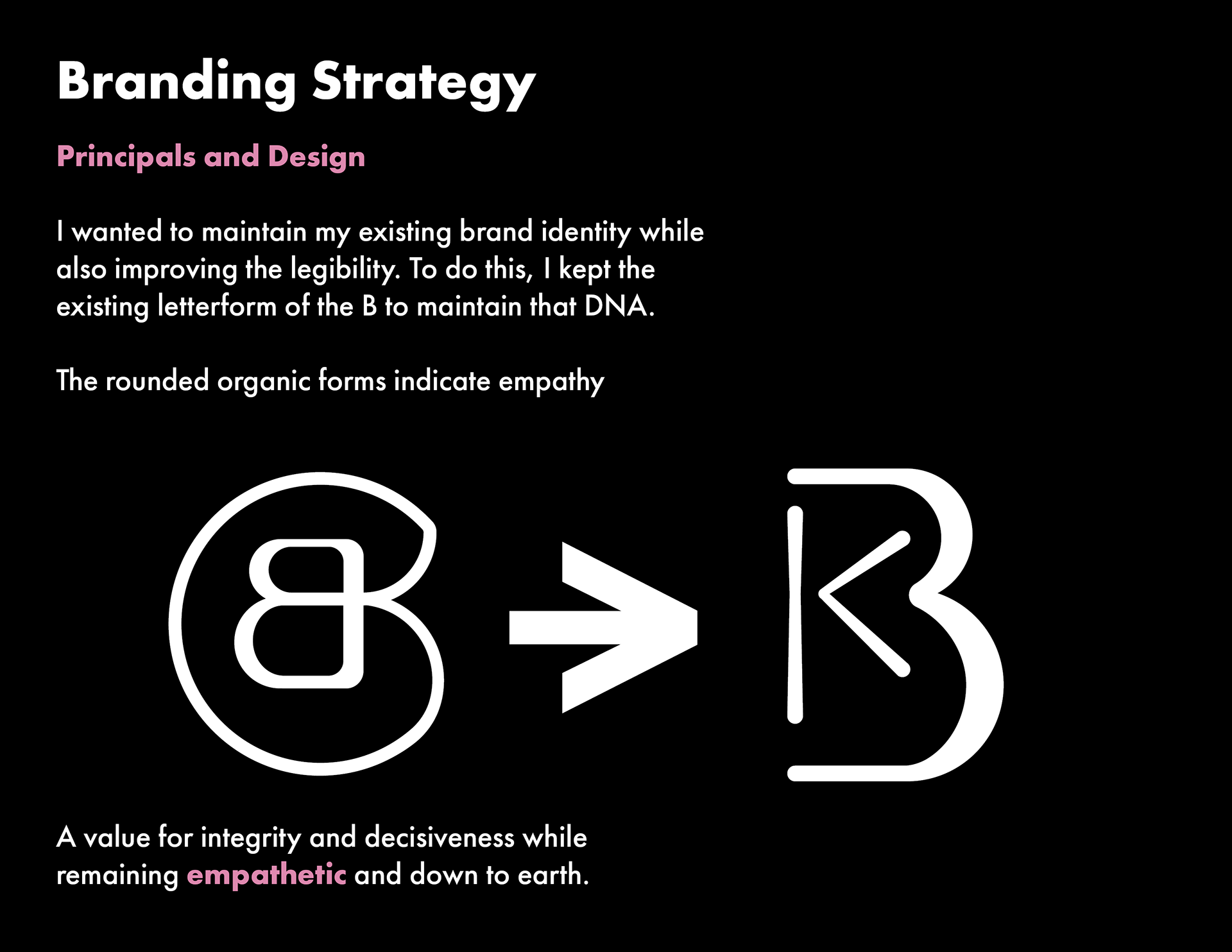
I had been using that mark for multiple years and had become somewhat illogically attached to it. I wanted to maintain some DNA link to it in my redesign. So, after much iteration and experimentation, I decided that the best and most legible method would be to reuse some of the same geometry and curvature stresses on the B in my new logo. The B was flipped to improve legibility and the K was decreased in size to create a hierarchy.
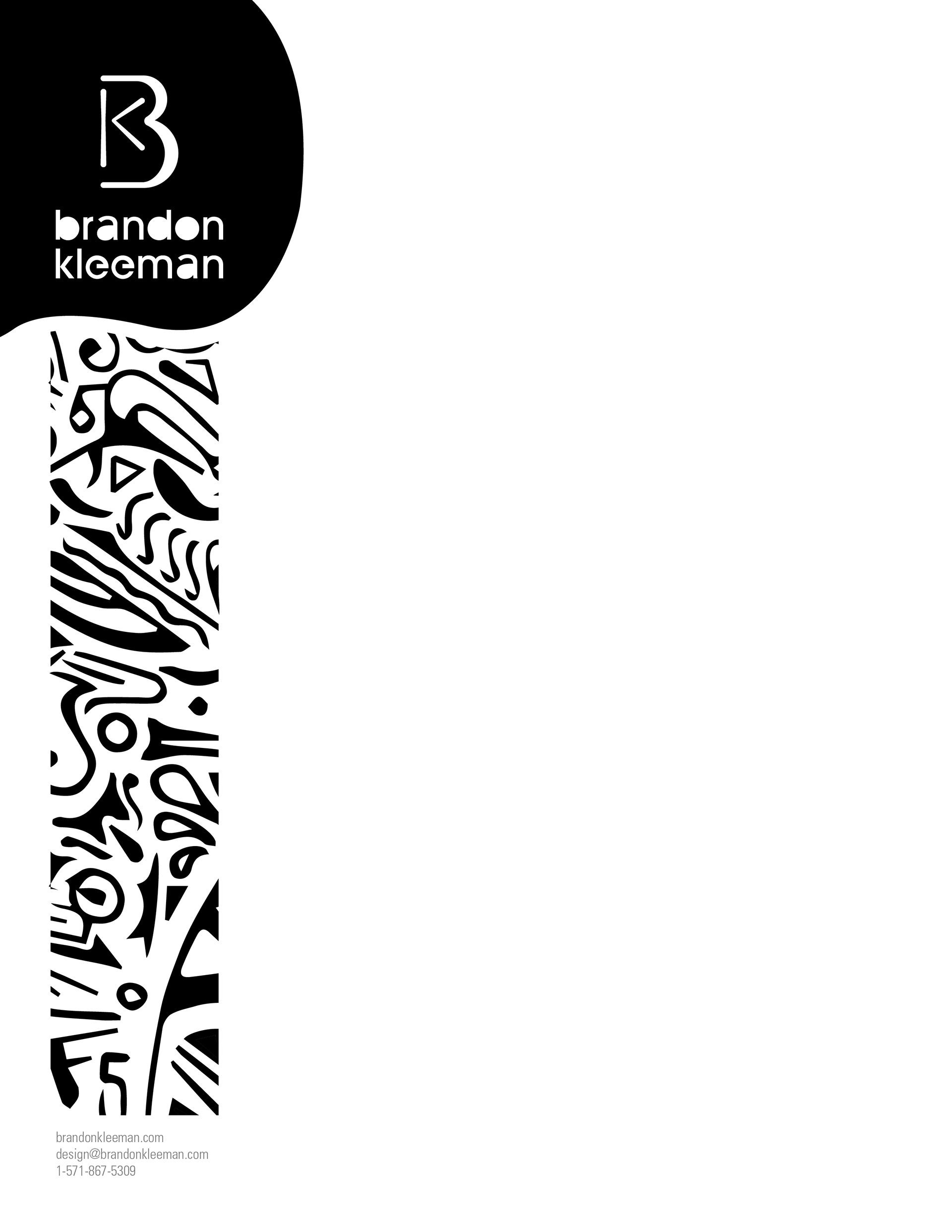
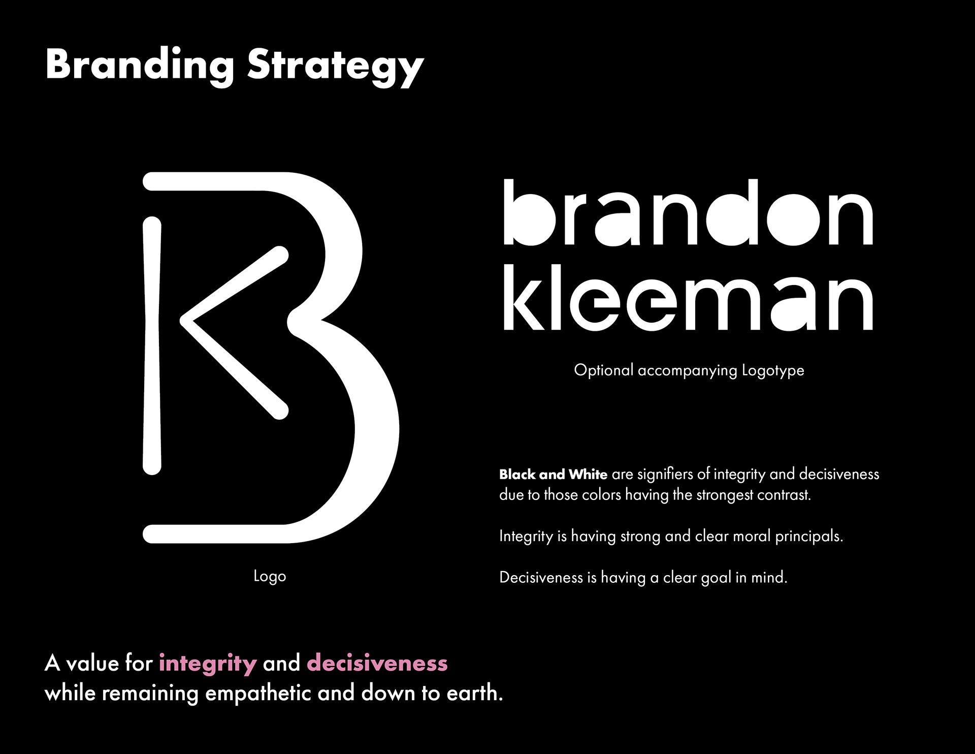
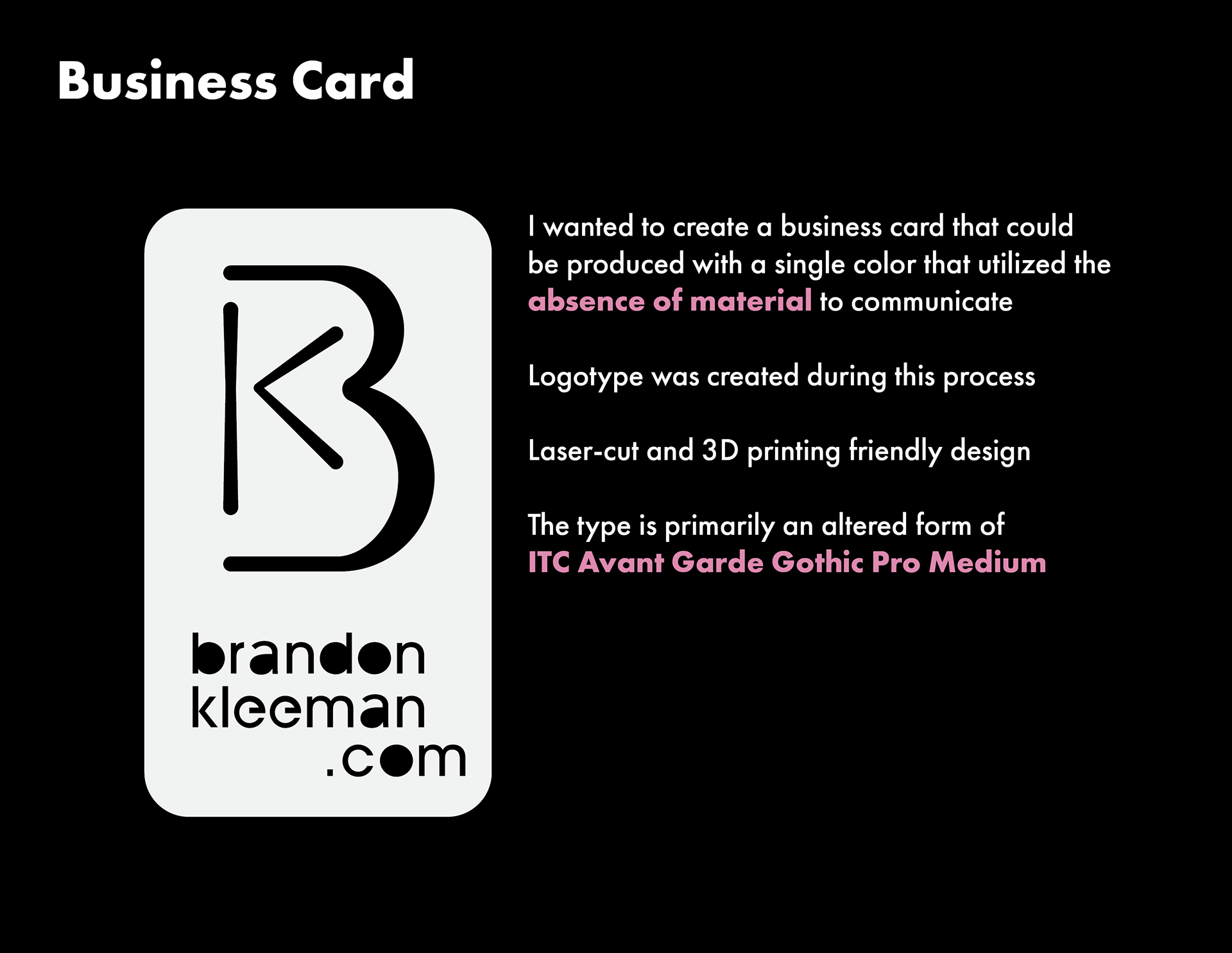
One feature of this logo, which inspired the business card design, is that there are no closed shapes in the design. This makes the logo both 3D print and laser-cut friendly.
I had been using that mark for multiple years and had become somewhat illogically attached to it. I wanted to maintain some DNA link to it in my redesign. So, after much iteration and experimentation, I decided that the best and most legible method would be to reuse some of the same geometry and curvature stresses on the B in my new logo. The B was flipped to improve legibility and the K was decreased in size to create a hierarchy.
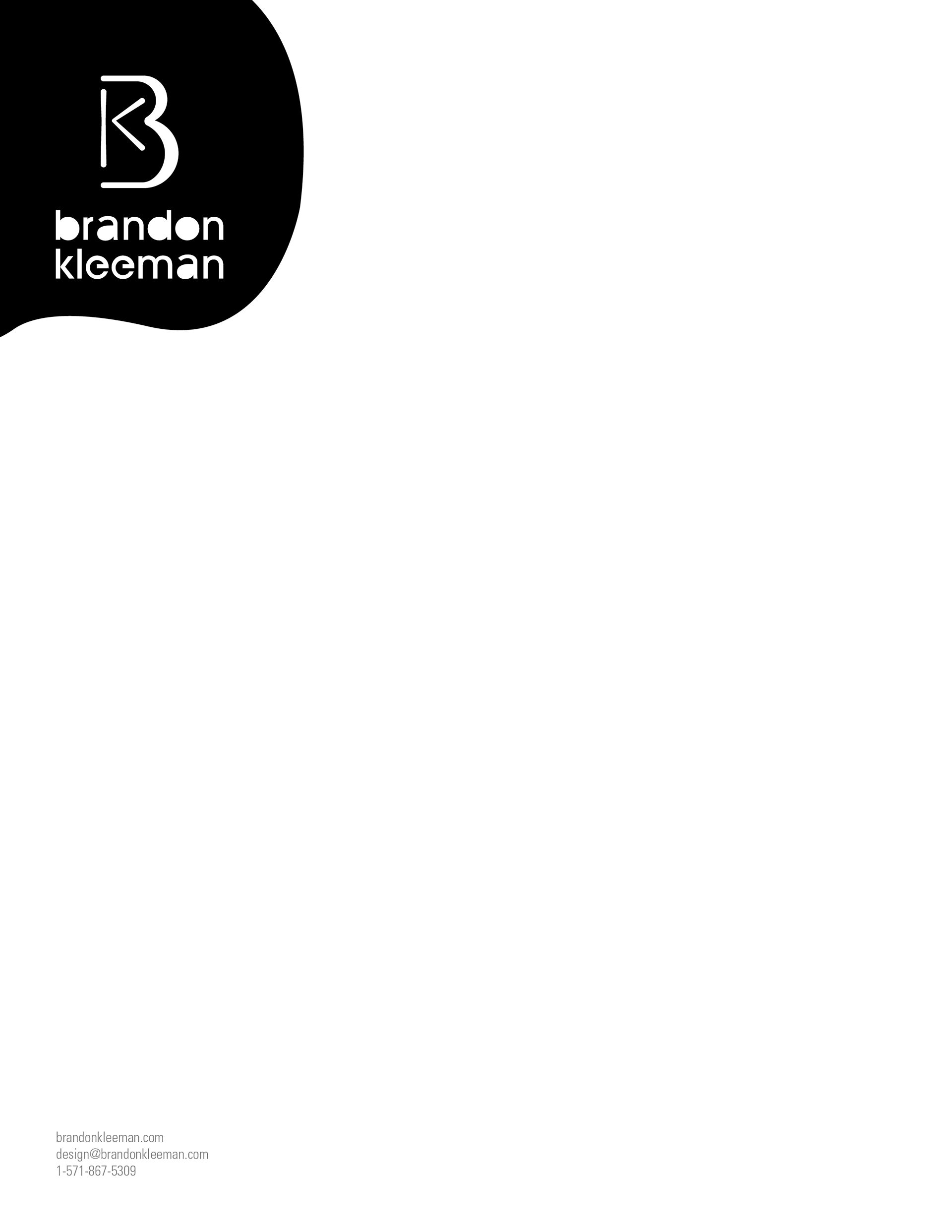
One feature of this logo, which inspired the business card design, is that there are no closed shapes in the design. This makes the logo both 3D print and laser-cut friendly.

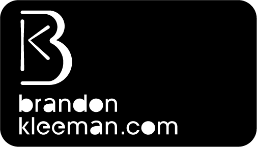

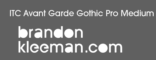
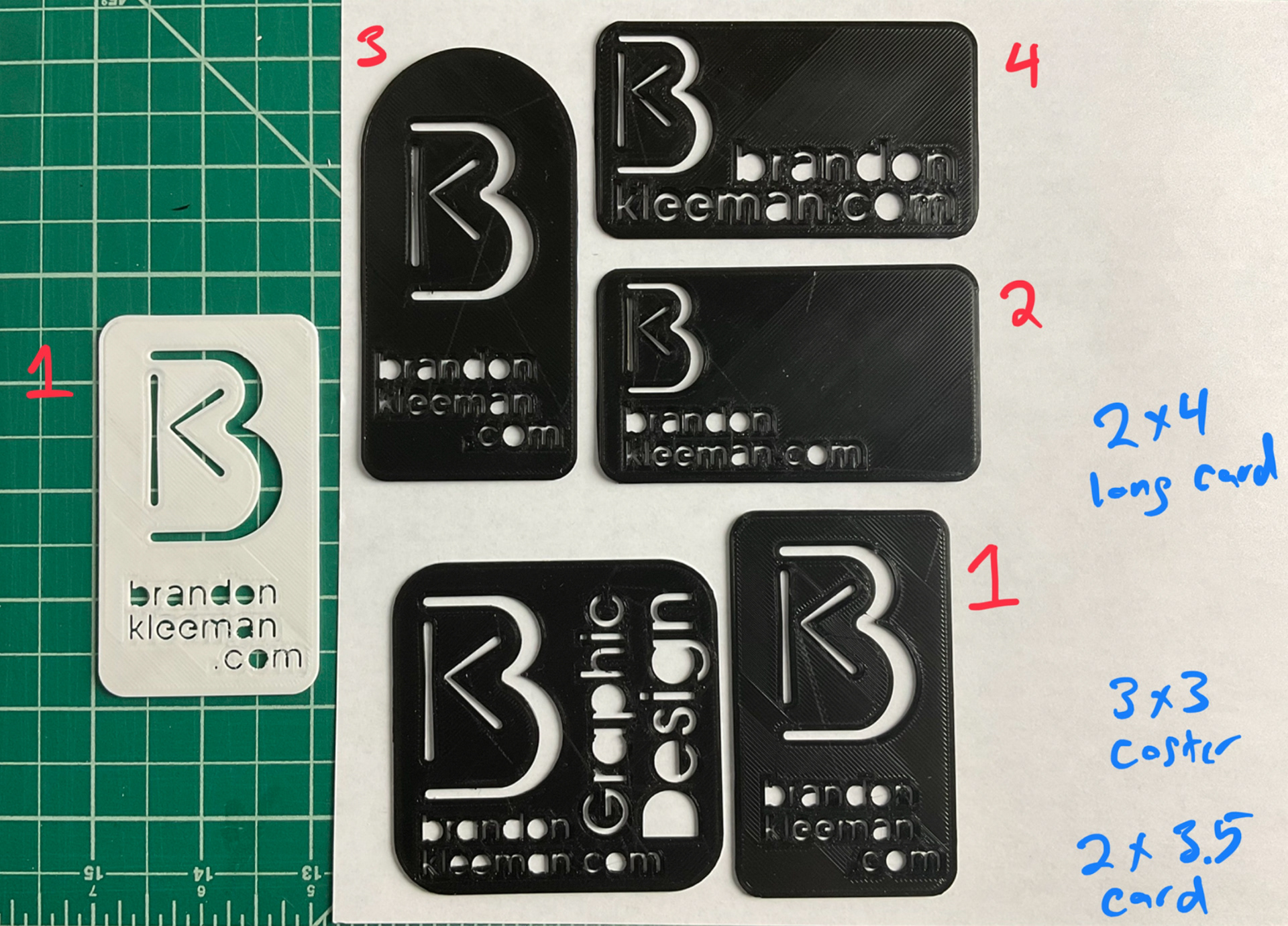
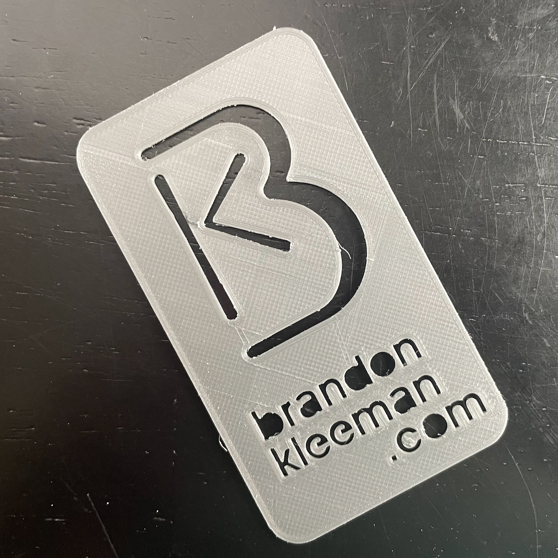
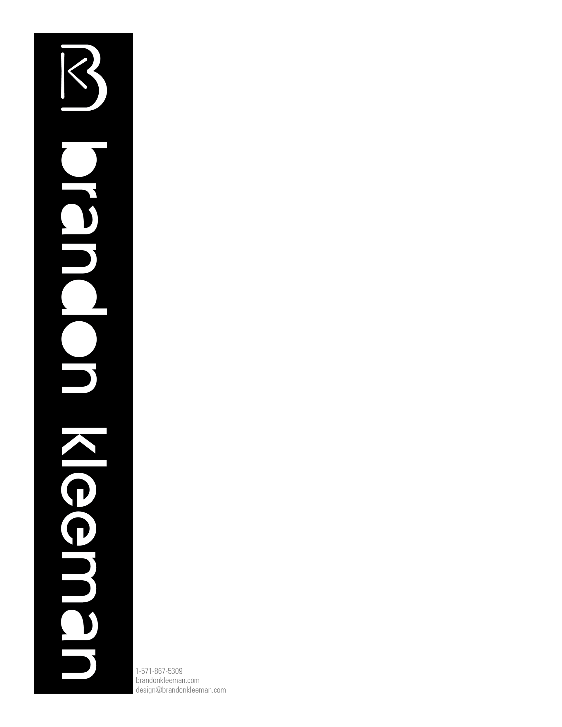
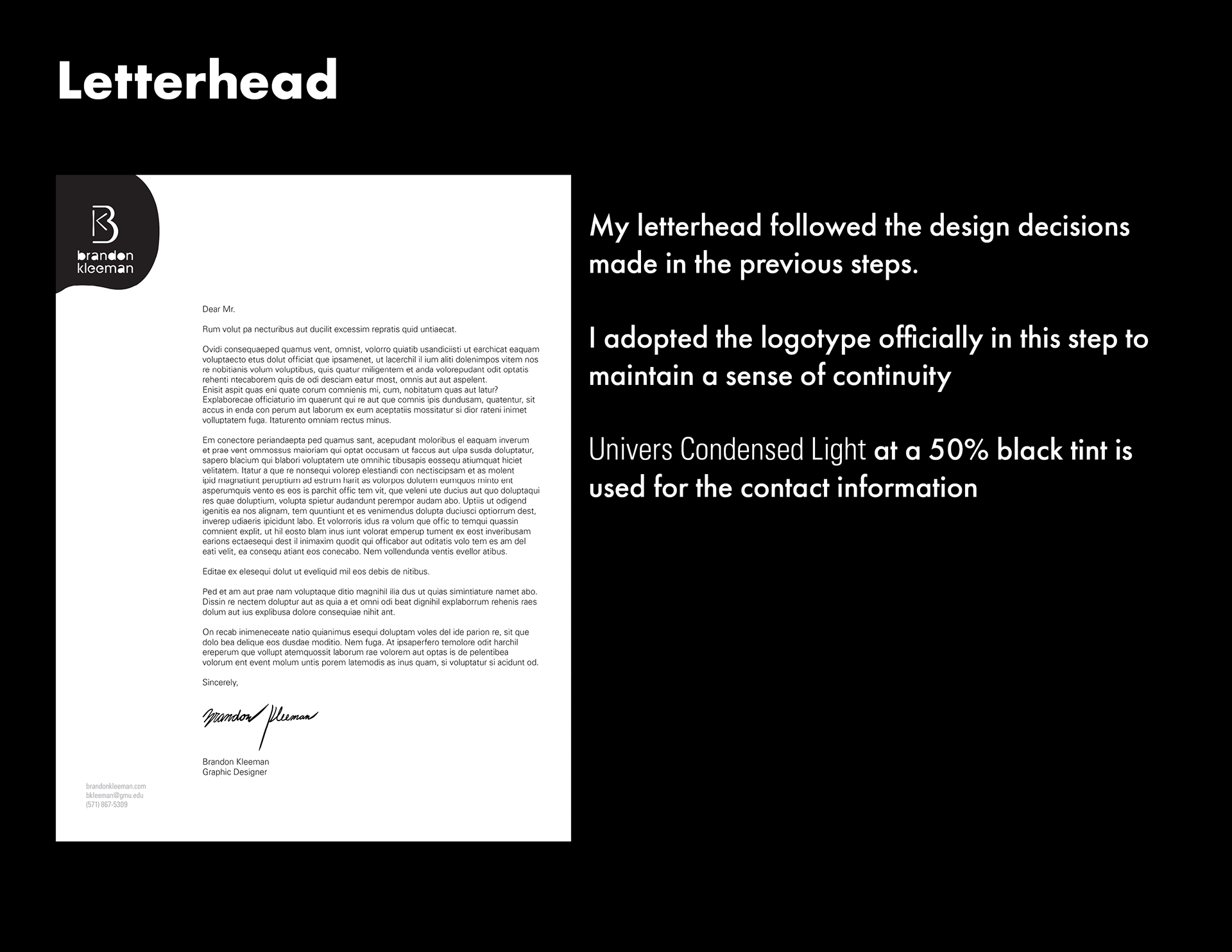
It was at this stage I created a logotype that would also be laser-cut and 3D Print friendly. It's a modified version of ITC Avant Garde Gothic Pro Medium. The card is surprisingly strong despite the large gap in the B. I printed it in PLA+ which is more flexible and heat-resistant than PLA.