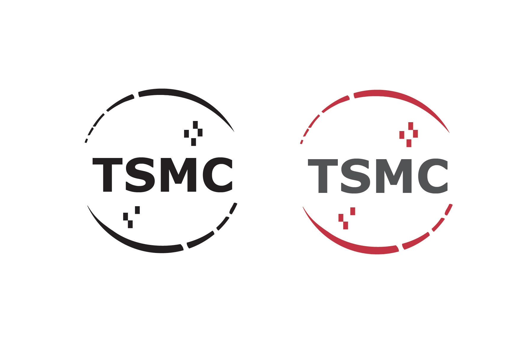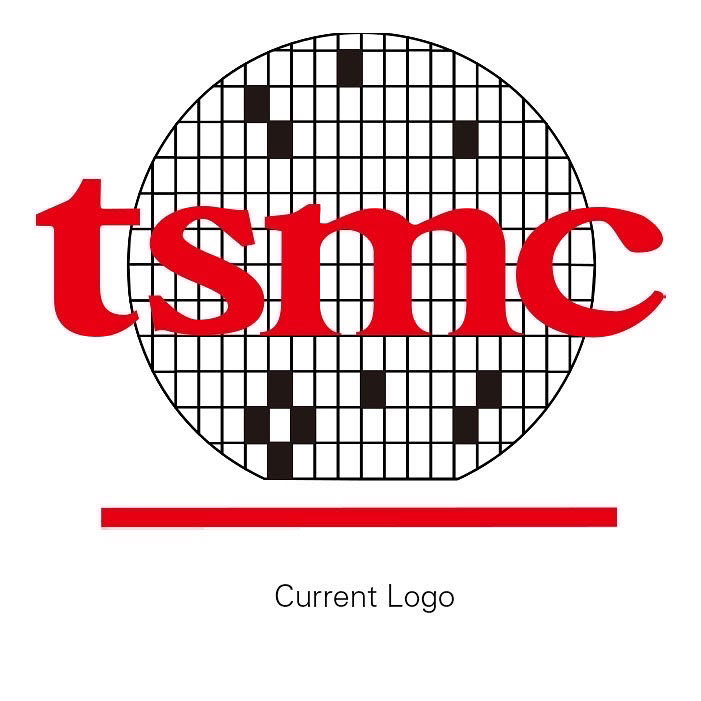
Logo Redesign. I decided to stick with the original concept of the logo but reimagine it in a modern context so that the long lineage and history of the company could still be mirrored in the redesign. The logo still eludes to the structure of the silicon wafer, but gone are the illustrative lines that segment the logo. These lines have been replaced with pixels that elude to the nature of the representation while leaving the overall design clean and modern. The typeface has been changed from a lowercase serif font to an uppercase sans-serif font. This change in the case makes the company feel more important while the switch to san-serif makes the company feel more modern and less antiquated. As they are at the forefront of semiconductor manufacturing the typeface should complement it.