Design Brief:
The task was to design a poster surrounding an event, tangible or fictional, in an effort to learn how to use textures in a larger format and how to manipulate type into its optimal form. For my poster I wanted to create an image that would draw in the eye. To achieve this goal, I decided that the format should be no smaller than a
Medium Standard Poster (18’x24’).
Medium Standard Poster (18’x24’).
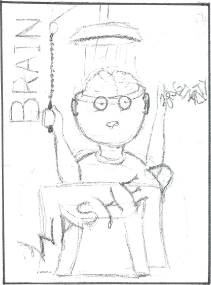
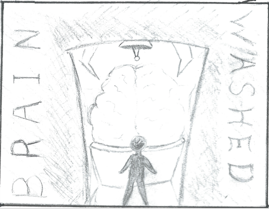
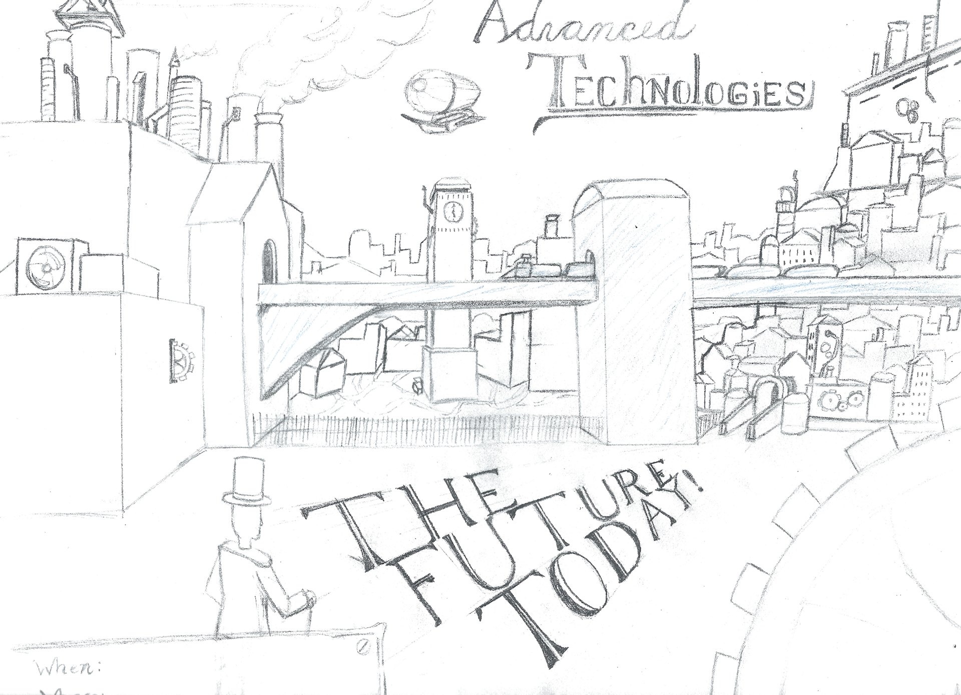
With my format selected I moved onto the idea stage. I wanted to create an image with a popping illustration. As the event could be based around any event, fictional or material, I perceived the idea behind image itself to be the most important aspect. In my brain storming I was drawn in by two ideas. The first being a steam punk cityscape full of intricate details and twists and turns. The second was the idea of brain washing and turning that concept into a literal representation.
I eventually settled on the idea of brain washing. Now I had to come up with the event surrounding the image. Eventually, I decided to theme my work around graffiti art as I had watched Banksy’s documentary Exit Through the Gift Shop earlier this year and had noticed that my illustration idea worked well with the ideologies that the artists had
displayed in that documentary.
displayed in that documentary.
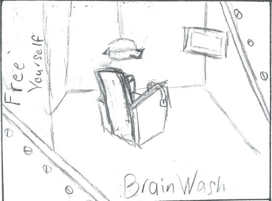
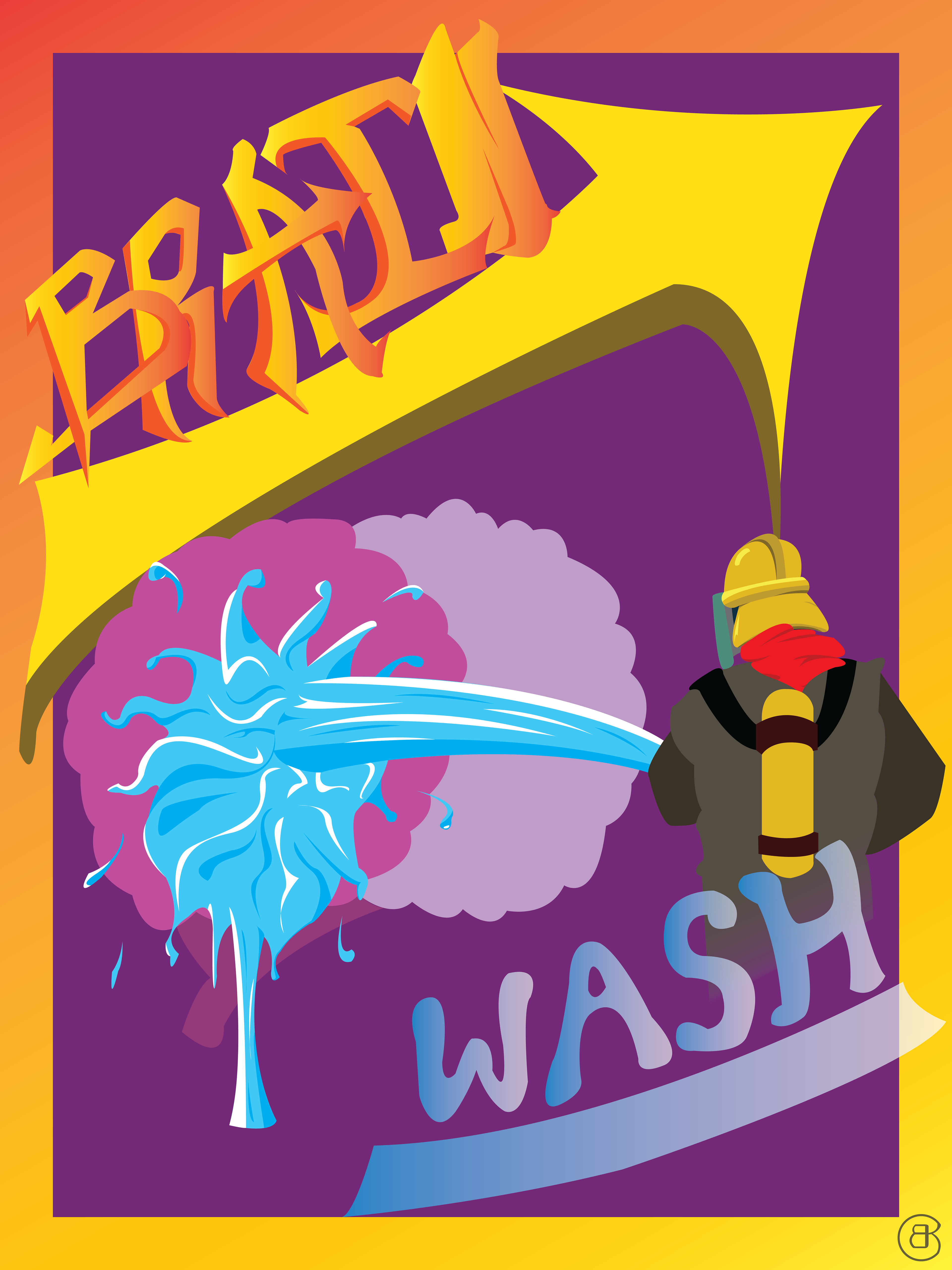
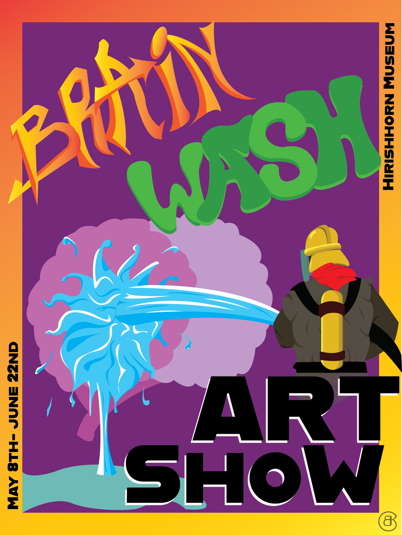
With my idea solidified it was time to choose my fonts and how they would work in the image. I didn’t feel there was any font that could display the title of my event the way I wanted it, so I opted to create my own text for the title. With the theme being graffiti art, I decided to fashion my text in a graffiti style. With the font finalized for the title, I had to now choose a font to display the informative text. For this I went with the font Hidden Treasures of the Bauhaus Dessau in the Alfarn Regular style. I love the juxtaposing cleanliness of this bold font. It both demands attention but not so much to overwhelm the viewer and take away from the rest of the illustration.
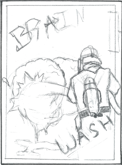
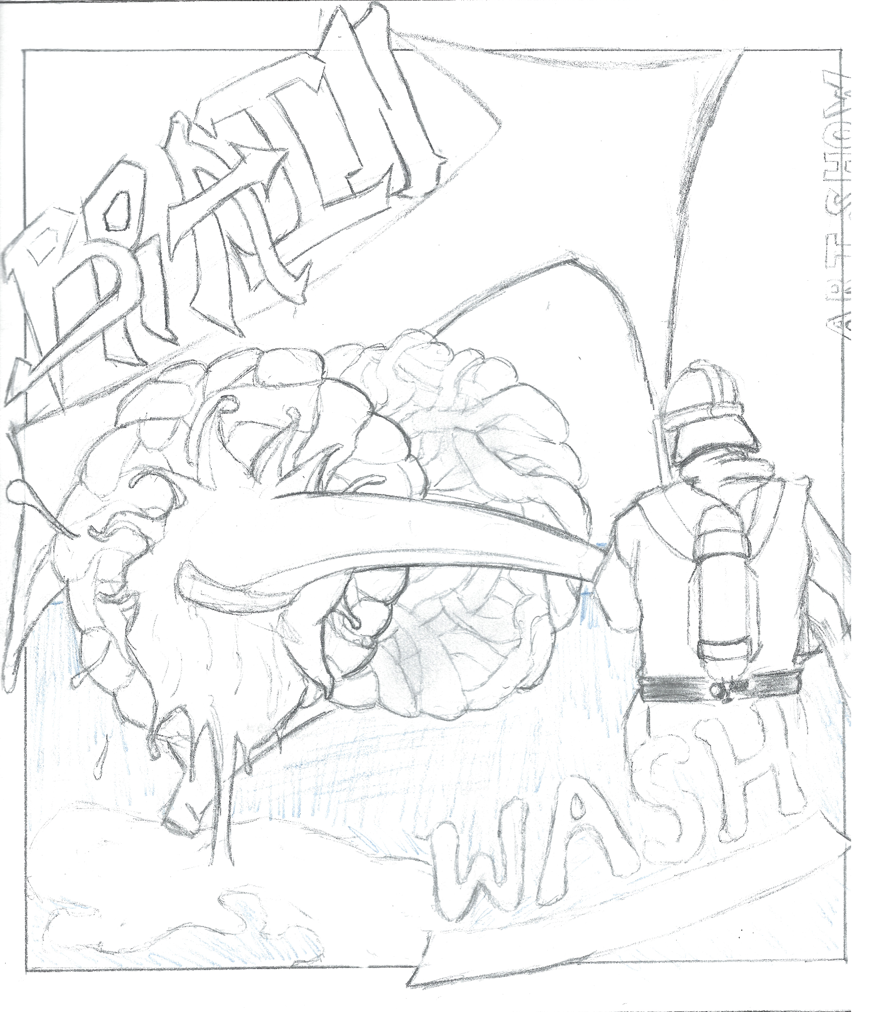
I then moved to the more formal composition stage. I choose the rough that I felt best conveyed my idea, a fire fighter hosing down a brain—washing out all creativity, identity, and originality. I fashioned my title split above and below the illustration, but as it being the primary focus from a text standpoint, I found the separation too jarring. It was at this point I decided to redo the font of the word wash as the water theme wasn’t working very well with the graffiti theme.
After laying out all my text and finishing the focal vector illustration, I moved the file over to photoshop to add some texture to the illustration. I created a clipping mask and threw in some textures with an extremely low opacity, just enough to add a bit of depth. I then went over the textures with an air brush to add a personalized touch to the textures. To finish it off, I added a slight blue tint to the purple background which helped make the illustrations pop out more effectively.